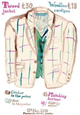
This is another temporary exhibition built out of Peter Blake's amassed ephemera of British culture over the past couple of hundred years. A lot of it is concerned with circuses, fairs and freakshows; and outsider art from shell artists to taxidermy (Walter Potter), tapestry (Ted Willcox) and Cheeta The Chimpanzee, the first non-human to exhibit in the National Gallery.
There were a lot of signs against photography. I made notes and drew, but the prohibition is a good reminder to take everything in in the time spent there, and to treat the whole thing as it was intended: not as a taxonomy of old-fashioned crafts, but a huge three-dimensional collage.
Carters Steam Fair looks like immense fun - and I've just found that it's still running!, complete with a wall of death.
Jubilee Steam Gallopers!
Jungle Thriller Ark!
Rock & Roll Dodgems!
Lightning Skid!
Excelsior Steam Yachts!
Victory Dive Bomber!
Wednesday, 22 December 2010
Tuesday, 21 December 2010
Swimming Pool
I've just been at the swimming pool. There isn't always music on, but this week there is - and it's all Christmas songs. My breast-stroke was hampered by a big grin when, after "Last Christmas", "Santa Claus Is Coming To Town" and "All I Want For Christmas Is You", the hall echoed with water-distorted orchestras on the most extravagant 1940s renditions of "White Christmas" and "The Christmas Song".
The pool looks a bit like this:
It's the screenprint that I was working on a couple of weeks ago. Something went very wrong, but it looks decent and may be worth revisiting.
That reminds me (by obvious debt, as you'll see below): the Bridget Riley roadshow has rolled into the National Gallery for the next few months. It's a different exhibition from that which has toured for the past year or two. Riley's team has painted some new and recent works onto the walls. Since my visit, I've been comparing them to the influences presented in the exhibition. Paintings by Seurat, Raphael, Mantegna and Van Eyck (an early copy by Riley) indicate the roots of Riley's approach to the interplay of elements; colour choices and the optical tricks of image-making. Best of all (although it perhaps shouldn't be), David Thompson's captivating film is there again.
"Red With Red 1", 2007.
Photograph: Bridget Riley/Courtesy Karsten Schubert, London.
From this Guardian article.
Photograph: Bridget Riley/Courtesy Karsten Schubert, London.
From this Guardian article.
Saturday, 11 December 2010
Art Sale In Southampton
If you're in Southampton before Christmas, come and see the Arches Bizarre. Several of the shop units in the Bargate Centre are turning into art spaces, and this one (on the top level, not far up from Shakeaway) has work by artists from the Arches studios and a number of Illustration students, including me.
I heard Nick Hornby on the radio a couple of Saturdays ago, talking about a teacher who prescribed distinctive lines as punishment for talking in lessons. I'll put a few of these in the shop but I'll have to justify the galling spelling mistake as a conceptual quirk.
PS: My hundredth post! I hope that's the right kind of verbosity.
End Of Term
This was the final week of term. The printroom has been pretty busy with first-years being taught chine-collé; third-years working on their final-minor projects; Charles Shearer making his own collagraphs and Katherine Anteney assembling some very complex Christmas cards.
A good number of us (including Joe Staples, whose papercuts and text I envy), are itching to get in next week if it's open. I have two screenprint studies ready to print, including these acetates for a swimming pool piece, which has been taxing my powers of logic.
Thursday, 9 December 2010
Explosive Seven-Inch
Friday, 3 December 2010
Magpies for Badgers
Here are a few old sketchbook pages for my illustration colleague Steph Goodwin (Oh Badgers! on Folksy).
The magpie on the left wishes he was a fashion designer, so he collects buttons and frippery.
The magpie on the right wishes he cold sail the oceans. He's building his nest as a ship.
These two work in a call-centre. The world defines them as call-centre magpies, but one would like to be an astronaut, while the other rues his failure to capitalise on his academic achievements.
This fellow is bored at the nightclub. He wants to sit down with a book.
Thursday, 2 December 2010
Harriscraft Handmade Cards
Are you enjoying the tips of holly and the red berries peeping through the snow? Is there anyone that you love and would communicate your love to through the medium of the gift card? Are you without the necessary stationery?
I recommend that you look at this Christmas set, which Cat Harris drew and I wrote on, all by hand and all with love.
Wednesday, 1 December 2010
White Christmas At Solent
December has started with snow and the illustration course at Solent has installed a Christmas tree piece in the main university reception. It's a good eight feet tall; made of wood; gaily painted and covered with doors, making it an advent calendar.
If you can, you'll have to go and see it in situ. As a bait, here are just the doors.
The piece was commissioned by Millais Off-Site Projects at Solent. Jonny Hannah masterminded the project. He and a group of the third-years painted and assembled the tree and made artwork to go behind the doors. I did a bit of sanding. The others involved are Alex Usher, Jen Hainsworth, Ryan Medlock... and here I'll have to add in the two that I don't know. [EDIT: they are Clari Csuk and Kate Wood!]
I'll show the insides later. Go and see it!
Tuesday, 16 November 2010
Picnic
Monday, 15 November 2010
Saturday
To the Natural History Museum to revisit the hall of minerals because I was reminded by the work by Boredom Research at Millais Off-Site Projects in Southampton.
Next to the V&A to make a survey of the ironwork for reference.
Then I realised: I'd photographed agate followed by a gate.
Next to the V&A to make a survey of the ironwork for reference.
Then I realised: I'd photographed agate followed by a gate.
Sunday, 14 November 2010
Wednesday, 10 November 2010
Evening At St Jude's
St Jude's is a gallery in Norfolk that brings together a number of contemporary printmakers. From time to time they exhibit in London under the name St Jude's In The City.
The current show is on for a couple of weeks at Bankside Gallery. Last night was the opening night and I tagged along because two of my tutors have work on display: Charles Shearer and Jonny Hannah. It was a real pleasure to meet some of the artists and find approaches in common with other people from the illustration / printmaking world.
I particularly liked the pieces by Ed Kluz, Alice Stevenson and James Brown.
That's the view from outside, on the south bank, without fireworks.
Sunday, 7 November 2010
Thursday, 4 November 2010
Warhol In Southampton
This evening BBC4 showed Ego: The Strange And Wonderful World Of Self-Portraits. Laura Cumming carried out a thoughtful and engaging survey of the genre, from Albrecht DĂĽrer to Mark Wallinger.
On the way (near the end) she covered Andy Warhol. Lately I've heard bits and pieces about a Warhol exhibition coming to Southampton. The show will be spread across the Southampton City Art Gallery and the John Hansard Gallery. Southampton University article; Artist Rooms page.
I haven't watched television for months. This evening, after Ego, The Pre-Raphaelites, The Culture Show and Nigella Kitchen, I may be convinced to make it a regular activity.
Grimm
The Grimms' Fairy Tales, one of the possible sources for the Fairytale And Folklore module that I began this week. I'm going with Italo Calvino's "The Italian Folktales".
Here, however, is my mother's book of Grimm stories, illustrated by George Cruikshank, first published in 1823 and published in this Puffin edition in 1948.
Now to research the meaning and context and produce images bursting with symbolism and allegory.
Wednesday, 3 November 2010
Adventures In The Printroom
Imagine a university printmaking room. There's one of those large rectangular sinks for washing items of all sizes. Below that a number of plastic and metal trays are stored.
Having made a number of prints and dabbled in marbling for the first time (having somehow never done it at primary school as most people do), I began the inevitable cleaning session. There were rollers, wood- and lino-cuts, palette knives and stone slabs to be cleaned, and I'm getting faster at it, but was bound to take about half an hour.
So to start at the sink I shoved a metal tray back underneath... and smashed the glass filter that takes the acid out of the waste. The floor was watery; the stand full of filter crystals and the air full of a rancid smell.
The sink has been sealed off and the maintenance people should be seeing to it urgently... but I feel very silly indeed and am now a little flustered, what with the plumber here and an Italian lesson to go to (and a power cut this morning).
That's the end of my woes. On the plus side, I might get to sell some of today's work by the end of the month.
Monday, 1 November 2010
Barbecue
Monday, 25 October 2010
Taizé
This weekend the Student Christian Movement and the Taizé community held a joint conference in Manchester. Most of the action happened at the enormous chaplaincy centre, but on Saturday evening a service was held in the cathedral.
That's a lot of students sitting on the floor of the cathedral. Towards the end of the service everyone lit tapers, so I had a go at painting in the dark with one hand.
Friday, 22 October 2010
Bridget Riley
Flashback
Southampton City Art Gallery, 17th September - 5th December.
Bridget Riley's retrospective exhibition has been on the road. Over the past year or so the collection has been shown in Liverpool, Birmingham and Norwich. Now it's at Southampton City Art Gallery, from 17th September to 5th December.
Those waves in my linocut (in the post below) remind me of Bridget Riley's famous black and white striped canvases from the 60s. Her pieces were instantly successful and engaging and entered the imagery of Swinging London. People respond to them in different ways, and sometimes have difficulty viewing them as pieces of art. They often seem more like optical illusions and colour theory, tricking the eye and creating movement. I find these perfectly valid and satisfying in an exhibition, which is why I'm glad to have seen the show both in Birmingham and Southampton.
The exhibition shows three or four rough periods of Riley's work, in chronological order. First comes the early monochrome precision and then the shimmering colour palettes ("June" almost invokes an actual scene). The final section is two huge canvases from recent years, combining surprising colours and comparing straight lines and curves, always with razor-sharp edges.
The Birmingham show was all in one room, to Southampton's three, which separate the time periods rather ruthlessly, even if the chronological flow is intended. However, the third room, isolating the two largest pieces, opposite each other, provided the best venue to give the work time (I'm considering a dissertation on the importance of a good gallery bench for the public appreciation of art). They could be on a boardroom wall, but the nuances of colour and the positioning of curves and verticals seem too specific.
This makes the show sound like a scientific treatise in optical theory. I'm content to enjoy that aspect, but it is really a riot for the eyes (particularly the second room). The meditative aspect is brought out in the video at the end of the exhibition. David Thompson's 1979 film shows Riley at work with numerous assistants, carefully adding lines and placing shapes (and I wish I was one of them); combined with lingering shots of water and branches; and clever filming that replicates the movement of the eye over the paintings.
If there's a progression over-all, I'd like to say that Riley loosened up, but a quick look back at the start shows that the playful streak has been present from the start. Every stage is dazzlingly clever and literally dazzling.
Post-script:
I was in the Art Gallery at noon and had forgotten about the clock tower's chimes. The melody is "St Anne", the most common tune for "O God Our Help In Ages Past", written by Isaac Watts, born in Southampton in 1674 and celebrated in Watts Park, over the road from the Civic Centre. I love that connection and trail of associations - which I needed my mother to unscramble.
Wednesday, 20 October 2010
Birthday Lino
Tuesday, 19 October 2010
Black Icons
A quick one before I dash back to the university to retrieve my diary. I was helping to collate a mailout for the Millais Gallery.
Anyway, the main entrance at Solent now hosts a full exhibition of prints by Ed Brown and Ryan Gillett, commissioned to celebrate Black History Month (November). Each piece shows a different historical figure and some fun use of text. The work was created and exhibited in part last year, and gained a bit of publicity. Now they're all on show and I went along to the opening because I trimmed and framed the set, and was assigned to help Ed with the setting-up of his degree show in June.
Here is Marcus Garvey on the banner and the two ends of the display.
Saturday, 16 October 2010
Ironwork
Winchester
I've just been on a brief trip to Winchester for a craft fair featuring Cat's stall for Harris Craft greeting cards.
Here is The Eclipse, close to the cathedral. I would call it my favourite pub in Winchester but really I need to give the others a fair trial in the name of research.
Friday, 15 October 2010
The Cult Of Less
Here is some work from a one-day project on my Illustration degree course. To produce an image in a few hours is a daunting thing, but realistic and highly improving.
The tutors gave us all a choice of three editions of a weekly column in the Guardian Weekend magazine, requiring an illustration of 105 x 105 mm. The Guardian has played a large part in this module on editorial illustration.
I chose "Is the 'cult of less' simply an exercise in obsession" - and we did not see image that accompanied the article in print.
After the 10am meeting we were sent away to work on ideas and present a rough image to the whole group at 12 noon.
Here are three of my sketches:
I tried to push myself beyond the immediate associations, and this was the most popular with the tutors:
This is the stage, in a professional job, when the client can change their mind about the specifics of the brief (and could still elect against the final image when they receive it). My tutors made suggestions for every student - in my case, the wonderful idea of shaping the showcase as a head. Now we had two hours to produce a final image. These are just two of the many rough variations that came out of this stage:
To send the image to the client it would need to be scanned in and edited, but I stayed with physical work, scaled up from the original dimensions. It was a real rush and I'd like to do more to my piece, but the exercise is about what one can do in the time. The final frustration was the smudge of blue in one corner from hasty work with the guillotine.
At the group meetings it was interesting to see how many of those working on the same article had come up with similar concepts, although they were executed in different media. Geoff Grandfield's published image shares elements with my and others' pieces.
These projects are excellent for spurring me to work and process concepts faster. We'll have another in a couple of weeks, meanwhile we have similar briefs on a one-week timescale.
Wednesday, 13 October 2010
Italian Tongues
Trentatré Trentini entrarono a Trento tutti e trentatré trotterellando.
I started learning Italian today. The teacher gave us a tongue-twister. I think it means "Thirty-three people of Trento entered Trento and all thirty-three toddled".
Friday, 8 October 2010
Herringbone
Tuesday, 5 October 2010
Angry Art
This week's project brief is to produce a cover image for the Guardian G2 supplement, to accompany a lead article about anger. I need to research angry art (the tutor's starting points were Francis Bacon, Arnulf Rainer and Otto Dix); think up graphical representations of rage and, perhaps, start flinging paint around like Brian Topp.
Before that, here is a brief personal moment from a few years ago. I was ANGRY.
Wednesday, 29 September 2010
September and October
September:
Here is WFMU's September Song archive from a few years ago. A selection of these are getting heavy rotation at the moment, but I'll have to stop tomorrow. Favourites: Charles Mingus, Harry James, James Brown, Lee Hazlewood, Santo & Johnny.
October:
A recent issue of Monocle magazine told me that Munich is "sometimes referred to as 'Italy's northernmost city'". Then I saw these delightful photos from the beginning of this year's Oktoberfest, in all its Germanic glory.
Tuesday, 28 September 2010
Roald Dahl
Speaking of children's books, here is a passage from "Storyteller: The Life Of Roald Dahl" by Donald Sturrock, published earlier this month. Roald Dahl's approach to storytelling is an inspiration: much of it is true of illustration, not only for children but for adults. The most entertaining, illuminating and memorable pictures capture the viewer in the same way that Roald Dahl engaged the reader. I've transcribed this section from Book Of The Week on Radio 4.
His publisher, Alfred Knopf, had been far-sighted when, in the mid-1960s, he described Dahl as "one of the wizards; one of the wonder-men of this age". Twenty years later the middle-aged wizard had become the grand old master of his craft. He knew how to shock; he knew how to scare; he knew how to keep the reader on the edge of their seat with excitement. He knew how to make them smile and how to make them roar with laughter. His "passionate purpose", as he described it, had become to teach children "to be comfortable with a book - and to read a book". He wanted to take them out of their everyday environment, filled with chores and schoolwork and to lift them into some kind of "marvellous, funny or incredible place". He was proud of being the voice of youth in a world that sometimes seemed to despise children, much as it seemed to despise him. Only a couple of months before he died he jotted down some notes for a lecture. To children, he reflected, grown-ups were giants and consequently all these people, whether it is the mother or the father or the teacher, were subconsciously the enemy.
This fact is not generally realised by adults. When I write a book which vilifies parents or teachers, eg. "Matilda", children absolutely love it. This is because the children shout "Hooray! Here at last is a grown-up who understands what it's like to be one of us."
He had outlined this philosophy more than ten years earlier in an article that reads almost as a manifesto for his craft.
What makes a good children's writer? The writer must have a genuine and powerful wish not only to entertain children but to teach them the habit of reading. He must be a jokey sort of fellow. He must like simple tricks and jokes and riddles and other childish things. He must be unconventional and inventive. He must have a really first-class plot. He must know what enthralls children and what bores them. They love being spooked. They love suspense. They love action. They love ghosts. They love the finding of treasure. They love chocolates and toys and money. They love magic. They love being made to giggle. They love seeing the villain meet a grizzly death. They love a hero and they love the hero to be a winner... but they hate descriptive passages and flowery prose. They hate long descriptions of any sort. Many of them are sensitive to good writing and can spot a clumsy sentence. They like stories that contain a threat:
--------o--------
His publisher, Alfred Knopf, had been far-sighted when, in the mid-1960s, he described Dahl as "one of the wizards; one of the wonder-men of this age". Twenty years later the middle-aged wizard had become the grand old master of his craft. He knew how to shock; he knew how to scare; he knew how to keep the reader on the edge of their seat with excitement. He knew how to make them smile and how to make them roar with laughter. His "passionate purpose", as he described it, had become to teach children "to be comfortable with a book - and to read a book". He wanted to take them out of their everyday environment, filled with chores and schoolwork and to lift them into some kind of "marvellous, funny or incredible place". He was proud of being the voice of youth in a world that sometimes seemed to despise children, much as it seemed to despise him. Only a couple of months before he died he jotted down some notes for a lecture. To children, he reflected, grown-ups were giants and consequently all these people, whether it is the mother or the father or the teacher, were subconsciously the enemy.
This fact is not generally realised by adults. When I write a book which vilifies parents or teachers, eg. "Matilda", children absolutely love it. This is because the children shout "Hooray! Here at last is a grown-up who understands what it's like to be one of us."
He had outlined this philosophy more than ten years earlier in an article that reads almost as a manifesto for his craft.
What makes a good children's writer? The writer must have a genuine and powerful wish not only to entertain children but to teach them the habit of reading. He must be a jokey sort of fellow. He must like simple tricks and jokes and riddles and other childish things. He must be unconventional and inventive. He must have a really first-class plot. He must know what enthralls children and what bores them. They love being spooked. They love suspense. They love action. They love ghosts. They love the finding of treasure. They love chocolates and toys and money. They love magic. They love being made to giggle. They love seeing the villain meet a grizzly death. They love a hero and they love the hero to be a winner... but they hate descriptive passages and flowery prose. They hate long descriptions of any sort. Many of them are sensitive to good writing and can spot a clumsy sentence. They like stories that contain a threat:
"D'you know what I feel like?" said the big crocodile to the smaller one. "I feel like having myself a nice, plump, juicy child for my lunch."They love that sort of thing. What else do they love? New inventions; unorthodox methods; eccentricity; secret information. The list is long, but above all, when you write a story for them, bear in mind that they do not possess the same power of concentration as an adult and they become very easily bored or diverted. Your story therefore must tantalise and titillate them on every page and all the time that you are writing you must be saying to yourself "Is this too slow? Is it too dull? Will they stop reading?". To those questions you must answer "yes" more often than you answer "no". If so, you must cross it out and start again.
Monday, 27 September 2010
There's Going To Be A Baby
Surprise!
Alright, it's not what you thought.
I just switched the radio on and heard that Women's Hour tomorrow will include the children's illustrators Helen Oxenbury and John Burningham. They'll be talking about "There's Going To Be A Baby", their first picture book together after decades of marriage. I've been looking forward to it since a visiting lecturer from Walker Books showed us some of the pages back in January or February. It looks completely wonderful.
Sunday, 26 September 2010
London Lives
London Lives
Bankside Gallery, 9th to 19th September 2010
Bankside is a contrast to the grand galleries. Instead of season-long tableaux of artistic titans, Bankside puts on short exhibitions that show the pulse of creativity. The gallery is a platform for a huge number of contemporary artists, so the displays really must change frequently. Even so, despite a run of only eleven days, London Lives, the top selection of a competition, was a dense and bristling collection of a hundred artists' submissions. That amount and wealth of work is what allows the show to represent London: a hundred aspects of the city and its surroundings. That variety allowed different media and different emphases to complement each other, capturing not only the timeless destination-views of the capital but the passing atmospheres of busy, changing streets.
London Lives.
Raphael
Raphael: Cartoons and Tapestries for the Sistine Chapel
V&A, 8th September to 17th October 2010
Only a week before the Pope's visit to London, the V&A's Raphael Court was augmented with this exhibition of tapestries commissioned for the Sistine Chapel in the Sixteenth Century.
The notes accompanying the display make the power games of the Vatican today look transparent and unbiased by comparison to the manoeuvres of the Medici. The selection of Biblical scenes for the chapel leant towards those that "reinforced the authority of the papacy" - ie. scenes of St. Peter, St. Paul and the early church.
The tapestries correspond to the cartoons (full-scale painted draughts on paper) that are on permanent display at the V&A (on loan from the royal collection after centuries at Hampton Court Palace since Charles I acquired them in Brussels before his ascension). In some places an additional painted copy is shown alongside. I found the most engaging part of the exhibition in comparing the sketches, cartoons, painted copies and interpretations by tapestry artists. Colours that work well in paint were swapped for ones that stand out better in fabric; extra space was given to craftsmen who excelled at foliage or wildlife.
The larger changes range from the theologically significant (Christ's position and gesture in "Christ's Charge To Peter") to the mildly-entertaining (on the tapestry Christ's white toga, unlike the cartoon, is covered in little golden suns). A case of sketches shows preparatory drawings of models making the same scene in everyday Renaissance dress.
Collectors in the Eighteenth and Nineteenth Centuries admired Renaissance artists' ability to "tell their story plainly". Raphael's images were revered for their "clear, dramatic narrative". The drama and dynamism are in fact souped up in the explosive stupification of onlookers at "The Death Of Ananias" and the fishermen straining at the nets in "The Miraculous Draught Of Fish".
The effect of all of this is spoiled when visitors turn to see the "Retable of St George", one of the permanent fixtures in the room: a magnificently painted and gilded altar screen demanding closer inspection. Very soon they recoil in horror when they see a few few moments of piety and triumph overwhelmed by a series of increasingly gruesome ways to die.
So, away from the subject of Raphael, here is a full list:
Retable of St George, c. 1410: altarpiece from the Chapel of the Confraternity of the Centinar de la Ploma
- The Holy Spirit
- Christ with the orb
- Moses; Elijah
- St John; St Luke; St Mark; St Matthew
- The Virgin Mary and the Child Crowned by christ and Surrounded by Angels
- A Christian Army under James I of Aragon Defeats the Moors with the Help of Saint George at the Battle of Puig in 1237
- Saint George Ties the Dragon with the Princess's Girdle
- The King, Queen, Princess and the People of Silene are Baptised
- Saint George Denounces the Pagan gods before Dacian
- Saint George is Tortured tied to a Cross
- Saint George Survives Poison
- Saint George is Tortured on a Table
- Saint George is put in Prison
- Saint George is Tortured between two wheels
- Saint George is Tied between two Posts and Sawn in Half
- Saint George is Tortured in a Cauldron
- Saint George at Prayer
- Saint George Fights the Dragon
- Saint George is Dragged by Horses
- Saint George is Beheaded
- The Agony in the Garden
- The Betrayal
- Christ before Caiaphas
- The Flagellation
- The Mocking
- Christ Bearing the Cross
- The Crucifixion
- The Deposition
- The Entombment
- The Resurrection
Wednesday, 22 September 2010
Eadweard Muybridge / Rachel Whiteread
Eadweard Muybridge
Muybridge is best known for his photographic studies of humans and animals in motion: multi-angle series of shots of, say, a woman walking down a set of steps and turning; or the image that proved that a horse can have all four hooves in the air in the course of galloping. I heard visitors announcing to each other "This is what we've come for" when they reached zoopraxiscopes and zoetropes (the contraptions that animated these series) two thirds of the way through this exhibition. Like me, they probably remember their inclusion in childhood books of experiments. Moving or 3D images are inately entrancing to us (remember the arrival of magic-eye pictures), but it is clear how, in the 1870s and 80s, Muybridge advanced cinematography, zoology and figure-drawing.
The preceding few rooms show the continuation from his ground-breaking work in photography - both the art and the technology. An Englishman in America, Muybridge (who frequently revised his name and identity) was keen to make the most of the newest arenas. His single-mindedness (which may have lead to some questionable ethical and moral choices, leaving aside the accusation of murder) and innovation are clear even today and his travels result in a document of American expansion in the second half of the 19th century, complete with Indians and Chinamen.
The daring and sometimes mind-bending views of Yosemite and San Francisco (I spent some time working out which way up the book should be, with another visitor) convey the wonder and the lure of both the American landscape and its new towns. It's not just because I've been there that these settings make the later images of Panama and Guatemala look quaint, despite their theatrical poise and precision.
Although the first few rooms hop about in the artist's chronology, they all lead up to the big draw, the high-tech experiments involving rapid-fire work with multiple cameras, prefiguring Matrix-style "bullet-time". He tried everything: analysing the movement of people with physical impairments; wrestling; splashing about in tubs of water; getting into bed and, most amusingly, a woman in a full Victorian dress and a large hat, leaping over a stool. The camera's ability to stop time and to split a subject into multiple angles (a trick replicated for visitors with a clever glass wall at the entrance and exit) proved what the eye couldn't see and still struggles to believe.
Rachel Whiteread Drawings
I can't imagine a more opposite artist to have printed on the same ticket and exhibited just through a wall or two from the Muybridge show. In the work of Rachel Whiteread it is the spaces that are captured and frozen; arenas of human activity are rendered monumentally still; busyness countered with contemplation.
Throughout this Autumn, Tate Britain hosts a fairly conventional appreciation of Eadweard Muybridge right next to this smaller (and cheaper) exhibition showing the byproducts or sideline of Whiteread's immense public sculptures: her sketches, drawings and doodles.
Some pieces show visual preoccupations that fed into full-scale work; some are simply intriguing by showing Whiteread's playful experiments with line; some show the construction behind specific works such as the Holocaust Memorial.
It's informal but technical, and accomplished despite being created without display in mind, but has no real conclusion. I'm not sure that the organisers know what to do with a collection that is neither a body of related work nor a progression of complete statements, but a scrapbook of a journey that isn't yet finished.
These two shows are running at Tate Britain from 8th September 2010 to 16th January 2011. Extra marks to the Tate for the A6 exhibition guides.
Post-script
On the subject of Yosemite, let's compare Eadweard Muybridge at Mariposa Grove in 1872 to my sister at Mariposa Grove in 1998. I've been debating whether it's the same tree.
Monday, 26 July 2010
"Paint something purple"
That's what Rob said this morning, when I idly asked for a challenge.
By the time I came to do something about it I'd been on a Youtube binge, remembering "Daria" from late-90s television. The result is a hasty and impassioned tribute (or fan-art cop-out) to Mystik Spiral's Freakin' Friends.
Sunday, 25 July 2010
Tuesday, 13 July 2010
The Waistbandit
I drew this on a train, back in March.
Even with Obama on our side (ref. Gawker), no good will come of boxer rebellion.
Tuesday, 29 June 2010
Faber Poetry
Whenever I'm in a bookshop (one that sells new books) I search first for any inspiring book covers. Firstly they're most appealing and secondly covers are a big part of professional practice as an illustrator.
Recently I discovered Faber & Faber's new set of poetry, new and old. The covers are all by contemporary printmakers in black and one other colour on white. The rough print effects are complemented by the textured paper finish. Here's the whole set.
Better still, one of the covers is by my printmaking tutor at Southampton Solent, Charles Shearer: fellow-Scot Don Patterson's "Nil Nil" (Look!), Although the traditional printmaking process is visible, it looks the most modern of the set. The others are delightfully retro in colour and style, but Shearer's shows how well abstract images can work.
Sunday, 6 June 2010
Polo In The Park
Today Louisa and I went to watch polo at Hurlingham Park in London. Here are a few pen sketches. I've given up on brush-pens for a little while out of frustration at endless issues with the ink-flow. One day I'll get it right. The watercolour experiments make up for that in part.
Drawing sporting activity is a challenge. I had a go at sketching karate a few weeks ago, but the polo was another thing entirely, especially as I'm new to drawing horses. Their heads come out the wrong shape. Thanks to Louisa for explaining all the bits and bridles.
There were national and international matches; displays of horsemanship (and cheerleading); fine food; fresh coconuts and Pimm's flowing like water - albeit at £7.50 per pint.
I may have found my sport to follow.
To think - until today I had never stamped a divot!
Subscribe to:
Posts (Atom)