Showing posts with label Print. Show all posts

Thursday, 11 October 2018

Printing Conkers

A lino block of conkers.
Warning: heavy autumnal themes and sighing.

You might guess that I would be making autumnal images. You probably share my enthusiasm for the flame colours, gauzy mists, bracing chills and mellow sunlight.

The season results in all sorts of eye-catching things lying about. You won't get many I-Spy points for the cuboids and cylinders of straw arranged in every other field or stacked like castles. You might get more for the occasional field striped orange with pumpkin production.

If you're a habitual collector, the natural world's annual, gentle shake-up will keep you busy. Leaves rattle at the roadside, acorns and pinecones pepper the woodland floor. Dry sticks clatter alarmingly and the hedges are sprinkled liberally with berries.

On a trip across or around any park, I'm preoccupied with looking out for conkers. They might be in their full shell; they might be gleaming unshelled in the grass. They might be perfectly round, dried and wrinkly or dome-shaped with a flat base. The empty shells might still be bright white on the inside or turning to a leather brown.

My conkers pattern.
Collecting is one thing but then there's the game. It combines careful selection and preparation with chaotic whacking and smashing.

I've covered this in a post two years ago and got a bit lost in methods of boiling and varnishing. Shortly afterwards, at the last outdoor party of the year, I put it all to the test. Really, there was no scientific conclusion. The ricochets, the shards and the perfecting of knots took over and it was all good fun.

So I may not be an expert but I'm not far from the people who are. This Sunday the World Conker Championships will take place near Peterborough.

I revisited some drawings and made a lino block. It's fine on its own (see above) but it was intended for repetition (see left). In recent years I haven't done as much relief printing as drawing, so this was a good return to the form, along with another pattern that I might show before long.

Edward Bawden's famous wallpaper designs had an influence. I hope that it has a complexity that breaks the chequerboard grid up a bit.

Printing a lino block with a fade multiple times on a page is a skill that I have not attained. The pattern is made from several individual prints with slight variations in texture.

Now I need to get outside before the rain shows Autumn's other face. Have some squashes to finish.

Bonus pumpkins!

Sunday, 5 November 2017

Bonfire Night Sparklers

Last Autumn it was conkers that got me excited.  This year it's sparklers.  (Will it be mittens on elastic next year?)

They're probably what I look forward to the most at a firework display and I have fond memories of sparklers in dark, damp back gardens.

First of three linocuts:  three scintillating sparklers.

I had fun producing these lino images of coruscating sparks, harsh but tamed, between bonfire smoke and one's own breath, the sharpness of the sparklers matches the crispness of the air.

Second linocut:  two sparklers and a November moon.

The prints are in three different shapes and on two types of lino (one being quite rough and misty), with aspects of monoprint and a fade from blue to black.

Third linocut:  a single sparkler in a smoky garden.

Having got these together during the week, I had my humble back garden firework party last night, with a full moon, as foretold in art.  They sparkled and went out - a tantalisingly transient pleasure.

The same again but in real life!

I think they're better in print than in photos.

Wednesday, 8 June 2016

A Monument To Architectural Folly

My love of a rusticated pilaster is documented.  I can dig a dog-tooth and ogle an ogee.  There is a wealth of obscure words for different shaped bits of stone and each one makes me feel that I should store it mentally in case it comes up in a crossword.

For my final day, for a while, of supervising the art school print room, I made a jolly three-colour screenprint that came out of some happy hours looking through books of architectural details and terminology.  It all came together this afternoon and this evening and all twenty copies came out pretty well.

Drawn and printed today!  A preposterous erection.

The books in question include works by Matthew Rice and Osbert Lancaster, Peter Ashley's "Preposterous Erections" and a King Penguin on the English Tradition In Design.

Here you will find:

Doric columns, interlacing arches, quoins, Venetian windows, consoles, crockets, a lucarne window, Elizabethan chimneys, egg and dart, shield-bearing lions, triglyphs, staddle stones and a crinkle-crankle wall.

That's just the main feature.  The border brings you trefoils, cinquefoils, linenfold, trumpet moulding, ball-flower, volutes and label termination.

Of course, an antefixa would have been a step too far.

Wednesday, 23 April 2014

St George's Cakes

"The cakes of England" are many and varied.  The named ones are not quite so evenly distributed.

I left out lots of savoury things (Dorset Knob, Bedfordshire Clanger) and sweets (Pontefract Cakes and Kendal Mint Cake.  Saint George (credit to Uccello's Saint George And The Dragon) is interested only in sweet cakes, buns and biscuits.


If there's one thing that makes me get a piece of work done it's St George's Day.  Last year's is here.  I made plans and demonstrations for this one some weeks ago, and wanted to get it all printed this week.  Yesterday morning I found that the date had crept up on me.  Over breakfast time, and feverishly, I cut most of the cake shapes.  Over lunchtime (the lunch break from jury service) I inked them up and got some prints.  The text came together in time for supper.

As I write this, I've just been asked if I know any St George's Day songs - specifically ones that are suitable to teach to a class of six-year-olds.  Do you know any?

More importantly, have you ever seen a Kentish huffkin?

Happy Saint George's Day!

Wednesday, 9 April 2014

Fruits Of The Press

My badge.
Two weeks in a room full of presses had to result in a few things to show, printing from lino, card and silkscreen.

As I have a supervisory rôle, I needed a badge to adorn my apron, to accustom the student body to my capacity and to show that I mean business.

Rebecca said that, upside-down, it looked like a toothy grin.


Painted pebbles.

The shelves and sills of my family home used to be dotted with painted pebbles.  My mother had picked out nice round ones and painted detailed butterflies.  Now they are outside the back door, in a little bed of varnished stones, and butterflies have given way to flowers.

That became a little lino print for Mothering Sunday.  It was quick and sinuous and simple.


Vegetables and fruit.

Now that Adam and I have an allotment, I expect its produce to creep into my work.  By the end of the year I will be drawing only squashes and peapods.

Working with card on card (for super-embossment), on the etching press (which required some tinkering with the Big Spanner), this piece is a quick celebration of our new endeavour:

broccoli, tomatoes, courgette (or marrow, depending on depth perception), onions, pumpkin, carrot, runner beans, chillies and rhubarb (or chard, depending on preference).


Silchester walk in detail.

The three-colour screenprint of a walk near Silchester fits into this post, although I wrote about it last week.  Here is a crop.

If you like a neat rural jumble, or the silent brashness of a farm field, look at the work of Carol Lander and Carry Akroyd.

As for screenprinting, the lesson to learn is to think about registering the layers.  To think about it early and to keep thinking about it at every stage.


Three little cakes.

Finally some card-cut cakes, which are a test piece for something to come.

Any other projects are under my hat for now.


Tuesday, 1 April 2014

Silchester

Silchester must be Hampshire's largest Roman site.  Calleva was a Roman town on the road from Londinium to Sorviodunum (Salisbury).  An uneven octagon of low walls filled with farm fields and abandoned excavations might not be the most potent historical experience.  Still, it was a satisfying goal-post for a country walk.

Starting at little Mortimer station, the route wove along the border of Hampshire and Berkshire, skirted the edges of farm fields and passed under lines of pylons, over stiles and along deep-set drovers' paths.  The Roman road marked on the map appeared to run under a field.  Most of the trees are still bare but the oilseed rape is beginning its display and the hedgerows are coming to life.  Fairly early on a sunny Saturday morning, everything was quiet except for chattering pheasants, shouts from riding practice, the distant rushing of trains and the trilling and mewing of what might have been a buzzard.  A red kite flew up right in front of us; a snake hissed and slid gracefully into the grass; sheep's wool fluttered from where it had snagged on a fence.

My screenprint of a walk near Silchester. 

I put this print together yesterday.  I almost threw it together and I'm glad of the urgency in the drawing and the registering.

Here is Adam's lifestyle photo of tea from a thermos outside the Calleva Arms ("4 Michelin Tyres!") in Silchester village.  We went in and had their stilton chips.

Tea in the sun at Silchester.

Wednesday, 4 September 2013

Moss

Here is one of my rare nature moments, from a few years ago, at university.

I was experimenting with texture in screenprinting.  I wanted to build dense prints from layers of simple strokes and flecks.

This piece was intended to be a subtle evocation of damp, velvety mosses on a wall.  The staff were not at all sure what I was trying to achieve with this variety of blobs and smudges.  I put it down as another instance of me having some atavistic feeling in my head that doesn't translate into reality.

My five-layered screenprint of moss.

Moss, lichen, heather and grasses have two associations for me.  The first is homely and human:  a part of nature that sits, semi-cultivated, in a human environment, the subject of diligent but leisurely botanical study; knowledgeable but twee.  I see shafts of dusty sunlight in the country gardener's shed in an Edwardian children's book.

The second is primal and timeless:  windy, prehistoric or post-apocalyptic heath and fenland, silent but for a few marsh birds or the sound of a Jute being scalped in a bog; ancient buildings fallen to ruin and repopulated by unassuming but patient plantlife.

Most of the time I need to make pictures relatively quickly.  In my case, that leads to a lot of little people, buildings and boats.  But I could enjoy spending weeks in a print room, making backgrounds, surrounded by pots of honesty and heads of pampas grass, studying the leaf-structure of heathers and hebes...  and drawing them with a more refined series of blobs and streaks.

Thursday, 29 August 2013

Winchester Cathedral

Winchester has a thing called the 10 Days Festival.

Badger Press, in Bishop's Waltham, set a brief for artists to make prints to go on display in Winchester, including the number 10, all ten inches square and in editions of ten.

Count the Tens - my print for Badger Press.

I had fun putting together a hotch-potch of Winchester Cathedral - the tiles, the Norman and gothic arches, the carved heads, the ancient graffiti and so on.  I had a demo sketch, but on Tuesday I made a research trip for a few more ideas.  This lead on to lunch (for my birthday) at Loch Fyne

Today I drew the final image, in two layers, and screenprinted it - with technical backup from the wonderful Omid and Clari.

Demo for the Winchester 10 Days print.

The deadline is this Sunday and the festival is from 25th October to 3rd November.

Thursday, 27 June 2013

More Tall Buildings

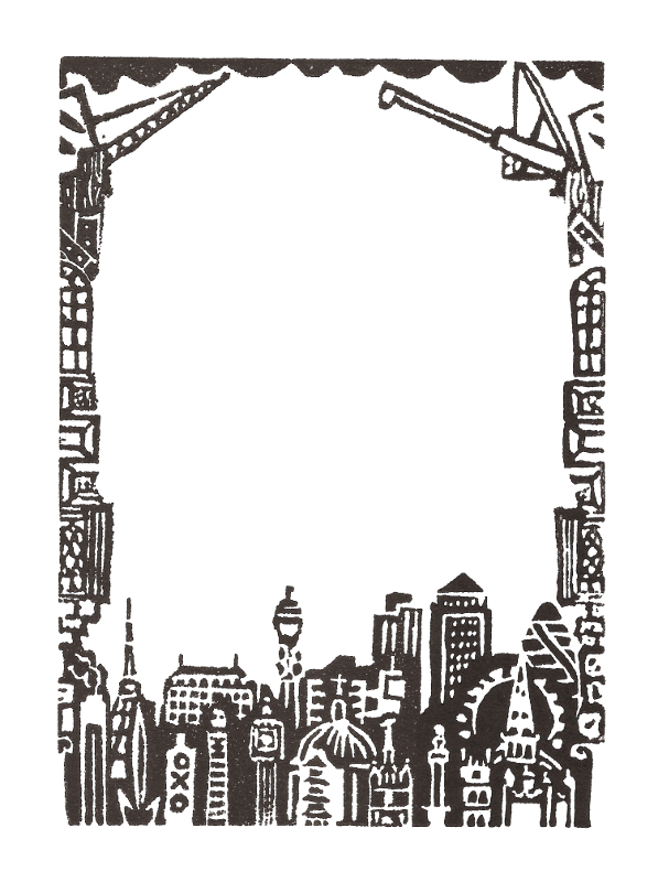
A quick update, because...  look what I found in the Empire Youth Annual 1948 (which I found on a wall nearby)!  It's rather similar to the linocut border that I've been making, showing a rough chronology of London's taller buildings.

The Empire Youth Annual 1948!
My linocut border from this week.


Friday, 10 May 2013

Bunting Update

A quick update on the current project - which I've been referring to interchangeably as bunting, banners or flags.

Here are some of the fruits of many hours of screenprinting.  It was going badly; it got worse; and this week it got much better.  I think I finally got the right mixture of paint and medium, and the right scale of pull (individual instead of three at once).  I've had numerous trips to Fabricland and carried great volumes of cotton around town on my bicycle, often at the same time as poster tubes.


Of the good prints, this photo shows just an eighth.  There are many more that didn't come through so strong.  Maybe they can go in less prominent positions.  One hundred and nintety-two is more than enough for the main area.

Await photos of the hanging!

Monday, 11 July 2011

The Leaning X Of Pisa


Here are four concertina-books that I've made in the past few days.
It all started when I doodled the Leaning Tower Of Pisa as a döner kebab, and then as a pea pod (because it's where the peas are) and then as corn-on-the-cob.

Naturally, food was the theme of the first booklet. You can see the semi-archaic blurb on the front cover - and there's more inside, advertising the rest of the series and tying me down to the following list:
  • Foodstuffs
  • Musical Instruments
  • Modes Of Transport
  • Foreigners

The frame of each page is a linocut, hand-printed without a press; the text is all stencils cut from acetate.

All this effort has gained me one of each, but it was fun to throw myself into it and I spent a lot of time researching some of the pages. Here are four out of each set of fourteen.


Saturday, 29 January 2011

Hectic times

A week of extreme busyness.

Today was my final day at Solent before going to study on the continent... and what a day!

I cleared the printroom of all my bits and pieces (the Pile Of Todd), because when I come back the department will have moved to another building. Before that I rushed to print a set of lino-cuts of ironwork patterns. I finished them last night at my parents' house, keeping the lino warm with their electrical-dining-room-hot-plate thing.

Other parts of the day: photography; photoshop; administration; Salvatore Rubbino's entertaining lecture; cycling back and forth; buying a large box...

but the best part was John Norris Wood's drawing session. He is our newly-appointed honorary professor of illustration. Yesterday he gave his inaugural lecture (highly comical for a number of reasons) on 20th Century British illustrators, starting from Edward Bawden.

Today he had arranged for a number of birds of prey to be brought to the drawing studio: a kestrel, a harris hawk, a Bengal eagle owl, a barn owl, two gyrfalcons and a great horned owl. We haven't had nature-drawing of this kind before and the atmosphere was magical. As Josef said, it really felt like being at art school.

We ended up going for sushi before I collapsed at home and failed to start packing for my trip.

Tuesday, 21 December 2010

Swimming Pool

I've just been at the swimming pool. There isn't always music on, but this week there is - and it's all Christmas songs. My breast-stroke was hampered by a big grin when, after "Last Christmas", "Santa Claus Is Coming To Town" and "All I Want For Christmas Is You", the hall echoed with water-distorted orchestras on the most extravagant 1940s renditions of "White Christmas" and "The Christmas Song".

The pool looks a bit like this:


It's the screenprint that I was working on a couple of weeks ago. Something went very wrong, but it looks decent and may be worth revisiting.

That reminds me (by obvious debt, as you'll see below): the Bridget Riley roadshow has rolled into the National Gallery for the next few months. It's a different exhibition from that which has toured for the past year or two. Riley's team has painted some new and recent works onto the walls. Since my visit, I've been comparing them to the influences presented in the exhibition. Paintings by Seurat, Raphael, Mantegna and Van Eyck (an early copy by Riley) indicate the roots of Riley's approach to the interplay of elements; colour choices and the optical tricks of image-making. Best of all (although it perhaps shouldn't be), David Thompson's captivating film is there again.


"Red With Red 1", 2007.
Photograph: Bridget Riley/Courtesy Karsten Schubert, London.
From this Guardian article.

Saturday, 11 December 2010

Art Sale In Southampton

If you're in Southampton before Christmas, come and see the Arches Bizarre. Several of the shop units in the Bargate Centre are turning into art spaces, and this one (on the top level, not far up from Shakeaway) has work by artists from the Arches studios and a number of Illustration students, including me.

I heard Nick Hornby on the radio a couple of Saturdays ago, talking about a teacher who prescribed distinctive lines as punishment for talking in lessons. I'll put a few of these in the shop but I'll have to justify the galling spelling mistake as a conceptual quirk.

PS: My hundredth post! I hope that's the right kind of verbosity.

End Of Term

This was the final week of term. The printroom has been pretty busy with first-years being taught chine-collé; third-years working on their final-minor projects; Charles Shearer making his own collagraphs and Katherine Anteney assembling some very complex Christmas cards.

A good number of us (including Joe Staples, whose papercuts and text I envy), are itching to get in next week if it's open. I have two screenprint studies ready to print, including these acetates for a swimming pool piece, which has been taxing my powers of logic.

Thursday, 9 December 2010

Explosive Seven-Inch


Here is one of the products of this month's burst of screenprinting. I love early-Sixties even-inches, and this one is just the bomb.