Tuesday 29 November 2011

Emily Sutton in Venice


Here are three pictures, by the wonderful Emily Sutton, of Rosa Salva, a cafe near where I stayed in Venice this year.

These and other works will be on show next month (3rd to 24th December) in Edinburgh, at the Scottish Gallery.  Here is their site.

Looking over photos of my trip has reminded me of the ideas that I had during that time, and that I never had time to follow up.  Since I returned people have expected me to be making art about Venice.  I'm hanging onto the claim that the Martyrs idea came from Italy.

I'll be screenprinting for much of today.

Monday 28 November 2011

Further Antiquity

More classicist fall-out from the dissertation...

It looks like someone had a better go at copying the Triumphs of Caesar than I did (here, a few weeks ago).  Here are woodcuts by Jacopo da Strasbourg, from Martindale's book on the subject.


For a while after handing the essay in, a few weeks ago, I wanted to banish all thoughts of Renaissance Art.  Now I'm seeing the effects of the study entering my art work:  Roman historians; the muses; sights of the classical world...  I'm playing at being the kind of classical fantasist that Mantegna surpassed in his time, through diligent study of real sources, not inherited ideas.  I don't mind starting here:  it's a fun world to illustrate and to bring lively detail into.

Here is a rhyme, quoted in Baxandall's "Painting And Experience", that pinpoints the value of insight and research, and sums up a good portion of my dissertation, along with being dashed poetic.


Saturday 26 November 2011

Slow Progress


I'm good at making a big plan for a project... and then failing to stick to it.  After a couple of weeks of slow progress, I was at least relieved to find that no-one in the year-group has got far off the ground.

College has been a good place.  We've had talks from the tutors about their work; I've made Christmas cards; people are using the new studios more (and someone knew of a piano in need of a home, so now that's in there, I like to imagine a tutor playing increasingly fast honky-tonk music to make everyone draw faster); the Solent Showcase gallery opened; and next week our honorary professor, John Norris Wood is giving his annual lecture and leading a one-day project, for which I need "a curious object".

As for the project, I'm still stuck on the its scale.  I could make a whole lot of martyrs, quite simply, or a few detailed ones.  I'm frustrated to be so undecided and to still be making lists of visual tricks to try.

A tutor pointed me to a few artists who make scenes of many extraordinary figures, darkness, narrative and drama:

Steven Campbell - Two Hunters immobilised by an excessive use of Bark Camouflage

Ken Currie - The Bathers

Peter Howson - Acheron

This is all much more extreme than my vision, which is a closer to this, Alice and Martin Provensen's "The First Noel".


The list of possible figures to depict is still long and could include a few more serious modern "saints", such as Dietrich Bonhoeffer and Martin Luther King.  I feel like I could spend years on this theme, especially when another tutor said that my research could form a part of the project.  I could spend even more hours combing through old books - John Foxe's "Acts and Monuments" and Thieleman J. van Braght's "Martyrs Mirror", whose stories of the faithful defined the identities of religious groups and of nations.  (See engraving).

The schedule that I made for this project says that I should be exploring text styles; body positions and facial features; symbols and backgrounds; light and dark.  It all sounds exciting but it's easier to just make more gingerbread men.

Here are:
a) Sketches from the British Museum, of Greeks fighting centaurs (I just drew the human figures).
b) Simple attempts at the first few of my selections from the Oxford Dictionary of Saints.


Monday 14 November 2011

Quattrocento


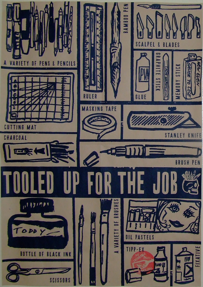
Now that the dissertation is in the past, I can bring out a few things that I found along the way.

I spent a few months trying to learn who was who in Italian Renaissance art, with the help of modern writers.

Here is a survey of fifeenth-century painting, as seen from the end of that century, in a section of a long rhyming poem (in terza rima) by Giovanni Santi, chronicling the life of his employer, the Duke of Urbino.  Santi, the father of Raphael, lived lived through much of the century, up to 1494, and looked with reverence to the artists that he named.  Here it is, first in archaic Florentine and then in English, from one of my main texts, Baxandall's "Painting and Experience in Fifteenth-Century Italy".

The picture, fittingly for my current work, is Domenico Veneziano's "The Martyrdom of Saint Lucy".

ne la cui arte splendida e gentile,
  nel secul nostro, tanti chiar son stati,
  che ciescun altro far parer pòn vile.
A Brugia fu, fra gli altri più lodati,
  el gran Jannès, e 'l discepul Rugiero,
  cum tanti di excellentia chiar dotati,
ne la cui arte et alto magistero
  di colorir, son stati sì excellenti,
  che han superati molte volte el vero.
Ma in Italia, in questa età presente,
  vi fu el degno Gentil da Fabrïano,
  Giován da Fiesol, frate al bene ardente,
et, in medaglie e in pictura, el Pisano,
  frate Philippo e Francesco Pesselli,
  Domenico, chiamato el Venetiano,
Massaccio et Andreín, Paülo Ocelli,
  Antonio e Pier, sì gran disegnatori,
  Pietro dal Borgo, antico più di quelli,
dui giovin par d'etate e par d'amori,
  Leonardo da Vinci e 'l Perusino
  Pier dalla Pieve, ch'è un divin pictore,
el Ghirlandaia, el giovin Philippino,
  Sandro di Botticello, e 'l Cortonese
  Luca, de ingegno e spirto pelegrino.
Hor, lassando di Etruria el bel paese,
  Antonel de Cicilia, huom tanto chiaro,
  Giovan Bellin, che sue lode èn distese,
Genntil, suo fratre, e Cosmo cum lui al paro,
  Hercule ancora, e molti che or trapasso,
  non lassando Melozo, a me sì caro,
che in prospectiva ha steso tanto el paso.


In this splendid noble art
  So many have been famous in our century,
  They make any other age seem poor.
At Bruges most praised were
  Great Jan van Eyck and his pupil Rogier van der Weyden
  With many others gifted with great excellence.
In the art of painting and lofty mastery
  Of colouring they were so excellent,
  They many times surpassed reality itself.
In Italy, then, in this present age
  There were the worthy Gentile da Fabriano,
  Fra Giovanni Angelico of Fiesole, ardent for good,
And in medals and painting Pisanello;
  Fra Filippo Lippi and Francesco Pesellino,
  Domenico called Veneziano,
Masaccio, Andrea del Castagno, Paolo Uccello,
  Antonio and Piero Pollauiuolo, great draughtsmen,
  Piero della Francesca, older than these;
Two young men like in fame and years -
  Leonardo da Vinci and Pietro Perugino
  Of Pieve, a divine painter;
Ghirlandaio and young Filippino Lippi,
  Sandro Botticelli, and from Cortona
  Luca Signorelli of rare talent and spirit.
Then, going beyond the lovely land of Tuscany,
  There is Antonello da Messina, a famous man;
  Giovanni Bellini, whose praises spread far,
And Gentile his brother; Cosimo Tura and his rival
  Ercole de' Roberti, and many others I omit -
  Yet not Melozzo da Forlì; so dear to me
And in perspective so far advanced.

Sunday 13 November 2011

Cutting Edge, Mottisfont

Another exhibition to see if you have the chance.

This one is at Mottisfont, near Romsey.  The grounds and the rose garden have been a big attraction for years, along with the ground floor of the house.  In the 20s and 30s the house welcomed numerous artists, whose work fills the ground floor.  In the past year the National Trust has opened the upper floor (formerly flats and offices) as a series of exhibition rooms, complementing the strong collection downstairs.

"Cutting Edge" is a show of six artists working with paper in one surprising way or another.

The hallway downstairs is hung from ceiling to floor with Eileen White's paper structures, "Come, Heavy Sleep" (named after the song by John Dowland); and the exhibition covers a complete range of size, right down to John Dilnot's tiny paper owls in miniature woodland scenes, and back up to Jonny Hannah's giant matches.  His roomful of vibrant Americana comes after the quietly bewitching and romantic papercuts by Rob Ryan (watch this interview at Printeresting), including a new piece, which is more enjoyable for sitting out from the wall very slightly.  Sally Sheinman's evolving project about human DNA invites the viewer's input.

Best of all is Ed Kluz:  his six "reliquaries" - crisp, clever paper models of pavilions and shrines, each in a glass cloche, clinging to paper rocks and surrounded by paper greenery and even paper water.  He is making the most of the structural qualities of different papers and cards, and the colours are rich like old toys.  They have a room to themselves, looking out over the lawns and woods around Mottisfont, a fitting setting for these mysterious old follies.


Cutting Edge
12th November 2011 - 29th January 2012
Mottisfont,
near Romsey,

Saturday 12 November 2011

Negotiated Study

The penultimate project of my degree has begun:  I have from now until early January to make something of my own choosing, falling roughly (in my case very roughly) into one of five categories - all areas covered in the past two years:  Editorial.  Text as image.  Children's picture book narrative.  Reportage.  Adult narrative.

My starting point is the approach that I used in the concertina books in July.  I enjoyed the immediacy and the combination of methods; and the idea was all my own.  Of course, I would like to develop further and try things out, but it's important to retain the simplicity - to do just one thing and to do it well.

Out of the masses of religious art that I saw in Italy, I was inspired by scenes of martyrdom:  their drama; the figure poses; the details in the scene; a saint's serenity paired with the the energy of a Roman guard swinging a sword.

I'm not producing oil paintings, or even full scenes:  rather, I want to make vivid scenes of martyrdoms famous and obscure; with minimal text.

Now that my topic is approved (and counts as "adult narrative"), I can start work and narrow the ideas down early, before the possibilities overwhelm me.  I'll need a schedule for research, drawing, production, arrangement... and for a Christmas break.

Today I'm working through books about saints so that I can choose the juiciest stories... but not always the most gruesome, which make me wonder about dedicating the whole thing to Amnesty International.  After that I can work on loose figure-drawing and facial expressions.

The series of images will probably form a set of prints.  Derek made the best suggestion for the layout:  building an altarpiece!  I'm very excited about that as a form of display and as a practical project.  It's a great link to my dissertation.  Okay, the work won't be exhibited, but...  I'm itching to do it.

It's only a college project but I'm excited about it like none before.

Thursday 10 November 2011

Jour de fête - The Creative Process


Here's a poster for the film club at the college a couple of weeks ago.  It was a short project, so here's an analysis of how it came together.

The tutor's brief, which I received on a Thursday morning by e-mail, read
a B&W image, 13 x 23 cms.
title of the film, un film de Jacques Tati, 1949.
Can I have it by monday morning please?
I knew already that it was to be Jour de fête and had watched a trailer (the bande annonce, on The Youtube), so I started drawing with a few ideas about rustic or small-town France in the late '40s; busy bicycles, postmen; disordered farm animals; clocks; French flags and the people scenery of a town.

The brief meant that I couldn't use colours, so no subtle coloured backgrounds; and the poster needed to be fairly simple.  My work usually comes out better when I've done something simpler than I'm comfortable with; and printing and rubber stamps always force simplicity, so I experimented with an old rubber cut into block shapes of a man's limbs and hat; making them into people or patterns.  That only came into the figure of the postman, Jacques Tati; the rest was in brush pen, keeping it good and rough at times.

The second difficulty was the dimension, which I assumed was to be slotted into a larger frame.  With a tall format it's easy to end up with empty space and I'm not sure even now that I used it best.  Eventually I sent the flow of the design outside the frame.

I was quick to settle on the bicycle as the central motif, perhaps with text inside it.  I ride a bicycle all the time but still had to look at pictures to get it right and make it more dynamic.

Still, I wanted more imagery to express the setting and feel of the film.  This lead to all sorts of French items up to and including the Flight Of The Conchords' shopping list from "Foux du Fafa":
Pamplemousse... ananas... jus d'orange... boeuf... soup-du-jour... camembert... Jacques Cousteau... baguette!
The boeuf and baguette made it into the border, mingled with the farm animals and postal items - the postal system seemed a good motif (stamps, packages, bugles, etc), especially as it lends itself to an air of busyness.  I had a stab at a border of French faces but it's not my skill.

For the text I took inspiration from one of my favourite books of type, "Lettering of To-Day" (1937, edited by C. G. Holme) - so many lovely old styles, but I wanted to avoid the ones that looked too English.

Above are all my drafts in sequence, up to the final piece.  I relied on being able to move a couple of things once it was scanned in.  I e-mailed it off on the Saturday morning because I was going away for a couple of nights and was very relieved to get a text saying that it fitted the bill.

When I saw it on the wall (see below) a few days later, in its border, I wasn't surprised that Jonny had inverted it.  It stands out a bit more in his design, so I don't mind.  Later I had a brief play with colour (see the "brown paper" effect), but I'm happy with the design, for a project that really only took one night of work, with time beforehand to think it over.


At five o'clock today the Illustration Film Club is showing "Submarine" by Richard Ayoade.  Fine Art are going head-to-head with us, showing "Blow-Up" in a nearby room at the same time.  It's a tough one, but I have gingerbread men and I'll make ours the better of the two.

Thursday 27 October 2011

Peter Jarvis Watercolours


Peter Jarvis (here is his website - look at his blog) is exhibiting his watercolour paintings in the foyer of Southampton Solent University from today.  The pieces are built around precisely replicated architecture.  The best images include settings of very convincing depth; vivid trees and graded skies.

Most of the exhibition is given to the sites of Southampton's old town.  Tudor House, God's House Tower and the others are rendered with great appeal.  More fascinating, though, are the close-ups of ancient stonework dotted with plant life and shifting shadows of branches; and two studies of metal boats rusting on the River Itchen.  These are more engaging than studies of stone and iron should be.

Aside from a view of Stokesay Castle, Shropshire, the main departure from the south coast is a set of nine round-towered Saxon churches in Norfolk (out of the one hundred and twenty-six in that county):  Bedingham, Brooke, Freethorpe, Geldeston, Hemblington, Morningthorpe, Seething, Surlingham and Thorpe next Haddiscoe.  They take me back to a happy holiday cycling in Norfolk, seeking out these little churches, and they're a great subject for a series.

A case of sketchbooks of all sizes shows Peter Jarvis' practice of sketching on site, usually outdoors.  It's easy to deprecate "Sunday painters" and the washy chocolate-box landscapes associated with watercolours.  These pieces, however, are a concert of three elements.  The stunning architectural draughtsmanship is made appealing by Peter's command of the subtlety of watercolours, making the views crisp, yet softened by every variation in colour.  In turn, Peter's eye for strong colours and warm sunlight in the surroundings brings the viewer half-way into the quiet, unpopulated scenes.

Of course, it's all pretty enviable and very different from my work, but it's a pleasure to see Southampton given such a treatment and, having met Peter now and then in the past couple of years, to see a proper display of his work.


A Point Of View:  a solo exhibition by Peter Jarvis
28th October 2011 to 7th January 2012
Concourse Gallery, Michael Andrews Building,
East Park Terrace, Southampton

Solent Website

Wednesday 26 October 2011

Essay Work

Books for my dissertation thus far:
  • Diane Cole Ahl "Benozzo Gozzoli"
  • Michael Baxandall "Painting and Experience in Fifteenth Century Italy"
  • Bernhard Berenson "The Italian Painters of the Renaissance"
  • Edward Chaney (ed.) "The Evolution of English Collecting:  The Reception of Italian Art in the Tudor and Stuart Periods"
  • Milton Grundy "Venice - An Anthology Guide"
  • Hugh Honour "The Companion Guide To Venice"
  • Andrew Martindale "The Triumphs of Caesar by Andrea Mantegna"
  • Derek Patmore "A Traveller in Venice and in Cities of North-East Italy"
  • John Steer "A Concise History of Venetian Painting"
  • Anabel Thomas "The Painter's Practice in Renaissance Tuscany"
  • Vasari "The Lives of the Most Excellent Painters, Sculptors, and Architects"
  • "The Grove Dictionary of Art"
  • "Larousse Dictionary of Painters"
  • "The Thames and Hudson Dictionary of Art and Artists"
I need to decide how much time to give to the different angles and which to drop.  The main areas are:
  • A case study of The Triumphs of Caesar
  • The artist/patron relationship
  • Processions in art
  • Representation of patrons in art
Right now I am overwhelmed.

Monday 24 October 2011

Memoirs Of Venice

I'm looking back on my time away in Italy after a couple of months headlong at life back in Britain.

Only now am I realising what I miss.  I've said all along that the effects of the trip would be clearer in hindsight.  Going through my diary, I see how much I did in my 194 days in Italy.

While based in Venice, I had nights away (sometimes multiple) for trips to Florence and Pisa; Ravenna, Rimini and San Marino; and Mantua, Parma and Bologna.  I made day trips to Udine, Aquileia, Grado, Treviso, Asolo, Padua, Vicenza and Verona; and explored the immediate area pretty thoroughly, from Jesolo to Chioggia.

The tutors asked me to give a talk about the experience:  what I did; how the Erasmus experience worked; what I learnt and how my work changed.  It was good to see my sketchbook pages on the big screen - they formed the basis of the talk.  I showed off my genuine Venetian masks and a few pieces of work.

The college is hosting a student from Liège this term, so Miriam will give a talk about her experiences in Southampton when she finishes.

Here is one of the first sketches for the Pisa booklets.

Saturday 22 October 2011

Tooled Up For The Job

"Don't draw your pens."

That's what I told myself when I started my time as an art student. I thought it too easy to focus on the mechanics of artwork and produce images that would strike a chord only with other artists.

Last month I was commissioned to do just that.

Before the start of this term, my tutors asked me to draw simple pictures of each of the items of stationery and equipment that the new students should have. Jonny and Derek came up with a list and sent me away for a few days.

We scanned the best drawing for each item and Jonny arranged them into a poster. He and Pete screenprinted a few dozen copies [pictured right] and I stamped them with "Unsinkable Press", for prints by the tutors.

Most of them were on pink cartridge paper, but here is one of the few on manila.


The posters were folded up and included in the first-years' welcome pack. I like to imagine them all heading down to Perry's art shop and showing the assistants what they need - before wincing at the prices.

It was fun to collaborate with the tutors and to stretch my drawing muscles before term started with time away from the drawing board, working on the dissertation, as I've mentioned.


The sketchbook work started a bit shakily, as it always does. Here is a page of attempts at scissors and stanley knife from the point when I hit my stride; and a couple of early stabs at brush pen and scissors.

Thursday 20 October 2011

Mantegna Cartoons

I'm writing an essay about Andrea Mantegna's "The Triumphs Of Caesar" series. For easy reference and to help me to analyse the nine canvases, I've sketched them from the reproductions in Andrew Martindale's book.


Monday 3 October 2011

Back In The Jug Agane

The third year of my degree started today - except that now it's called Level 6. In fact a lot has changed. We're in a new building; the staff have changed about; the grading system is different... and the grades will all count towards my final mark.

At two o'clock this afternoon we had our first assembly, back from the holidays with the staff lined up in front of us. On this day last year I got the times mixed up and missed the first meeting. Thus it was only today that I was taken back to new school years. It all reminded me of this passage from "Back in the Jug Agane" (1959) from Geoffrey Willans and Ronald Searle's Molesworth series - especially when Jonny made a reference to Proust.


Chapter 1:
I MITE HAV KNOWN

[...]
CLANG-PIP. CLANG-PIP. CLANG-PIP.
It is the skool bell which sumon us to asemble in big skool into which enter anon GRIMES, the headmaster surounded by a posse of thugs and strong-arm men in black gowns. The beaks, of course, alias 'my devoted staff'.
[...]
Now GRIMES stand on the platform, smiling horibly at the pitiable colection of oiks, snekes, cads, oafs and dirty roters below.
'Welcome back,' he snarl, 'Welcom back to st. custards for a new term. I hope you had a good hols? i did myself - spane, the s. of france, then on for a couple of weeks to the italian riviera. This term, of course, the fees will be higher to meet the mounting costs.'
But this evidence of good humour is short-lived. Without warning, he bare his fangs.
'Now listen, scum,' he yell, 'The last mum hav departed in tears. You are in my clutches agane and there is no escape. And its going to be this way this term. More work, increased production, trades unions supresed and the first boy i hear who sa poo gosh at a skool sossage will get 6. And strikes won't help you. If you go out the shop stewards will be flogged.'
'Remember this,' he leer, 'You never had it so good.'
[...]
'And wot,' sa GRIMES, 'have we all been reading in the hols?'
Tremble tremble moan drone, i hav read nothing but red the redskin and Guide to the Pools. i hav also sat with my mouth open looking at lassie, wonder horse ect on t.v. How to escape? But i hav made a plan.
'fotherington-tomas,' sa GRIMES, 'wot hav you read?'
'Ivanhothe vicar of wakefieldwuthering heights treasureislandvanity fairwestwardhothewaterbabies and ---'
'That is enuff. Good boy. And molesworth?'
He grin horibly.
'What hav you read, molesworth?'
gulp gulp a rat in a trap.
'Proust, sir.'
'Come gane?'
'Proust, sir. A grate fr. writer. The book in question was swan's way.'
'Gorblimey. Wot did you think of it, eh?'
'The style was exquisite, sir, and the characterisation superb. The long evocative passages---'
'SILENCE!' thunder GRIMES. 'There is no such book, impertinent boy. I shall hav to teach you culture the hard way. Report for the kane after prayers.'
Chiz chiz to think i hav learned all that by hart. It's not fair they get you every way. And so our first day end when we join together singing our own skool song.
St. custard's is brave.
SWISH.
St. custard's is fair.
BIFF BANG WALOP.
Hurrah hurrah for st. custard's.
SWISH SWISH SWISH.
As lashed by the beaks we join our boyish trebles in this fine old song we feel positively inspired i do not think. We are in for the joliest term on record. In fakt, i am back in the jug agane.

Thursday 21 July 2011

Leaning Stones

This week I came across this photo of the Rolling Stones. On top of being a gorgeous photo with great quality colours and clothes that should be worn today, it sums up how I wanted the people to look in the "Foreigners" installation of my "leaning things of Pisa" series.

Link

Friday 15 July 2011

One Year Left


Today the third-years got their final results. It steels me to to knuckle down and work as hard as I can next year... but sometimes my high ambitions don't let me loosen up, and I keep trying to rival all of art history (and achieving nothing).

Should I be calculating and try to please as many as possible of the tutors who will assess my work? Should I make the most of the facilities while I have them? Should I try to make myself a professional?

I've seen other students end up bitter about the tutors - perhaps because, after three years, they feel that they now know who they are as artists.

It will be a heavy year; I wish everyone on the course the best of winds.

Monday 11 July 2011

The Leaning X Of Pisa


Here are four concertina-books that I've made in the past few days.
It all started when I doodled the Leaning Tower Of Pisa as a döner kebab, and then as a pea pod (because it's where the peas are) and then as corn-on-the-cob.

Naturally, food was the theme of the first booklet. You can see the semi-archaic blurb on the front cover - and there's more inside, advertising the rest of the series and tying me down to the following list:
  • Foodstuffs
  • Musical Instruments
  • Modes Of Transport
  • Foreigners

The frame of each page is a linocut, hand-printed without a press; the text is all stencils cut from acetate.

All this effort has gained me one of each, but it was fun to throw myself into it and I spent a lot of time researching some of the pages. Here are four out of each set of fourteen.