Monday 23 December 2013

The Games Cupboard

It's the night before the night before Christmas and I'm looking forward to some comfy evenings in with home-made biscuits, a wide range of cheeses and a well-stocked games cupboard.

Here's a quick array of some of the games that must be brought out from some nook for the holidays.  There should be travel sets and novelty cards and battered heirlooms held together with yellowed sellotape.  I don't understand cribbage, canasta, bridge or backgammon, but you can always play with the pieces idly, and their presence is comforting somehow.

Good old games, from bridge to yahtzee.

Only a few weeks ago, I discovered the chess & bridge shop on Baker Street.  It's curiously entrancing, even for someone who plays neither game (at least without getting frustrated), and a warming presence in a famous but quiet part of London.

Now, as the weather outside truly is frightful, I wish everyone safe journeys and warm firesides.

Friday 29 November 2013

Where I Work

For the past three months I've had a desk at The Design Chapel.  It's one of the little cemetery chapels in Southampton Old Cemetery, converted for office use, with an upper floor installed.

My desk is behind those shelves, by the perpendicular piping.

Over the past week I've made daily sketches of the inside, picking views where the office furniture contrasts with the Victorian gothic walls.

Looking up from my desk to the dove window.

Upstairs, by the stained glass window.

The altar of printing.

The kitchen, built against the arches.

At this time of year, the owls are hooting and screeching outside by the end of the working day.  In Summer there are bats:  I don't know if they make use of the chapel, but it does have a little belfry.

The outside of the chapel is rich with detail, so I'll make a study of its Romanesque columns and medieval-y gargoyles before long.

Wednesday 20 November 2013

Southampton's Coat Of Arms

Southampton's coat of arms.
Here are the arms of my home town:  three roses...  red and white...  hearty and unfussy.

Of course, the coat of arms is displayed here and there around the city.  I remember staring at the one on the wall of the scout hut, with a strange woman rising out of the top of a castle.  You can find several versions online (including this page of postcards and cigarette cards).  There are a few variations, chief of which is the ambiguity over which way round the red and white are, with the counter-charged roses.  I've seen a description that left the matter open, to the effect of "three roses on a shield that is half red and half white":  with three roses divided between two halves, you can go either way.

The official description, here at the council's website, is more specific, and blames a seventeenth-century herald for drawing it up wrong and causing confusion.  But is the figure on top a queen, or is she Lady Justice?

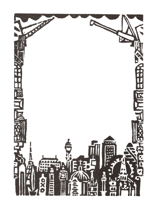
Recently it has been my turn to draw the coat of arms, on a Christmas card for the mayor.  In the past I've made a few experiments, such as this linocut for a border, showing the elements of the coat of arms - the roses, lions, ships-on-a-sea, castle-on-a-mound and the "quene in her splendour" holding a sword and scales - all processing out from the shield.

My linocut of the figures from Southampton's crest.

Drawing the whole crest involves working out the mantle (the fabric floating either side of the helmet) and getting the ships and lions right.  Having spent seven months in Venice, and possibly spent a total of seven months of my life looking at books on heraldry, I might have hoped to be better at drawing lions by now!  The final piece includes six in total - including the two that are smaller than a fruitfly, either side of the dome of the Royal Pier building.

The project took a few drafts and conversations, concerning what the mayor wanted and what I like drawing.  We ended up with an array of buildings around the crest.  I can't draw a bunch of local buildings without including Wyndham Court, and I was sad to have no space for the Harbour Lights cinema.  The quarter-jacks of Holyrood Church are a favourite; the Red Lion pub's half-timbering is fun to draw [an aside:  last night I enjoyed Jonathan Meades' 1998 programme on Worcestershire - here is his barrage of half-timbering].  Buoys and container ships are another essential element.

The bridges circling the coat of arms are the Itchen Bridge, Cobden Bridge and the old Redbridge.

Southampton!  The mayor's Christmas card for 2013.

To finish, here are two of the various old badges available for the London & South Western Railway Company, using (without permission!) the arms of London (top left), Southampton (bottom left), Portsmouth (bottom right), Winchester (centre right) and Salisbury (top right).


Now it's time to make my own Christmas card, and I must live with the niggling fear that I got something wrong in the crest.

ADDENDUM!
(two days later)
Alterations!

Thursday 24 October 2013

The Sea Inside


Philip Hoare in the my work last year.
With apologies.
Philip Hoare's "The Sea Inside" was published this Summer.  As he's from Southampton...  and the book is about the sea and Southampton...  and Southampton is all about the sea...  and illustrators are all about the sea...  a project came about, involving the school of art at Southampton.

(Last year, when I hadn't met him, I included him in the "writers" section of my "People Of Southampton" piece.  It's not a great likeness.  I gave him the tail of the whale, for his celebrated book "Leviathan - or The Whale")

The exhibition came together in time for the start of the new student year, but it began in March or April.  It was a bit hush-hush at first, because the book wasn't out yet.  We had excerpts to work from...  I'll give you the description from the exhibition:

The Suburban Sea is a collaborative art project between three organisations:  Red Hot Press, Southampton's Open Access Print Workshop; Southampton Solent University's Unsinkable Press and Students at Norges Kreative Fagskole in Oslo, Norway.

Taking inspiration from the opening chapter of The Sea Inside by Philip Hoare, artists from each organisation were asked to respond on a single sheet of Somerset Paper.  This was then passed on to the next organisation and given to an artist or student to work on again - this time responding to both the initial extracts of the book and the work that was now on the paper.  After the second artist had worked on the paper it was passed on again.

It proved to be an interesting and, at times, challenging project asking artists to work blind, to challenge their existing practice and to explore new mediums of working.

We hope that you like the results.

My "first layer" of a collaborative piece.

"Working blind" really is a strange challenge - leaving space for the next artist, who might respond differently, and hoping that they wouldn't obscure what I'd done.  Working on top of someone else's layer was even harder.

I picked the excerpt that described swimming in Southampton Water (he does it every day), and fleshed it out with vignettes of life on the waves:
"The water is so clear it scares me.  Fish jump up as though they'd dropped out of the clouds.  Everything is rising to the surface, summoned by the light, slowed to the sea's heartbeat.  The water brims like an overrun bath.  I push out through the stillness of the standing tide, my hands creating the only ripples."

The piece on the wall with another layer on top.

Only at the exhibition / start-of-term celebration did I get to see what happened.  Some of the pieces (including two more that I worked on) had three or four layers.  My first had only one layer on top, which I'm pretty sure is Jonny Hannah's work.

Experimental illustration from Southampton School Of Art & Design!

A few of the collaborations in the exhibition.

Look at Philip Hoare's blog - Leviathan Or The Whale.

Thursday 3 October 2013

Southampton Planning

Here's an artefact from the background work for my degree show, back in May of last year.  I was researching critical appraisal of the city's architecture, particularly addressing modernism.  Owen Hatherley's "The New Ruins Of Great Britain" was a big influence on the content of the project.  Another was Jones The Planner's two blog posts about Southampton - "Southampton Dreams" (July 2011) and "Oi Southampton Masterplanners!" (April 2012).

Mainly for my own reference and development of ideas, I drew the second of the two, copying the photos and writing snippets of the text.  It takes in the legacy of historical styles, the effects of the twentieth century, recent attempts at regeneration and the city council's master plan.

My drawing / Jones The Planner's blog post.

The blog is still turning out long and rewarding pieces, about Exeter, Bristol, London...  and Stockholm and Copenhagen!

Wednesday 2 October 2013

Southampton's Arts Paper

Issue 5 of SOAP
The latest issue of SO.A.P. has been distributed, featuring updates about lots of projects and groups in the area.  It's a free paper that comes out a few times a year.  There are updates on


and plenty more - all behind Johnny Toaster's great cover images of Southampton.


The centre-spread poster this time is a display of my drawings from Copenhagen, with some flouncy text that I wrote about sketching on holiday.

Centre spread by me!

Here is SO.A.P. on Facebook.  Go out and pick up a copy!

Tuesday 1 October 2013

Sketches from Stockholm

Following my post of drawings from Copenhagen, here are a few from the couple of days that I spent in Stockholm before getting the train to Denmark.

Sergels Torg office blocks

First, the domino-row of office blocks between Sergelgatan and Sveavägen, seen from the window of  Coppola Caffé, on Sergels Torg.  We spent a lot of time there, making the most of the free refills, which seem to be fairly standard in Copenhagen and Stockholm.  The café is in on of the big shopping centres overlooking Sergels Torg, which a big junction and plaza, and one of the hubs of the city.  There is street entertainment and stalls, surrounded by modern blocks and grand department stores.

Karlaplan
Karlaplan is a round park at the head of a smart boulevard, with a fountain at the centre.  It was quietly busy on a Sunday morning.  Here is the view, in slices, from the pinnacles of buildings above the ring of trees to the benches around the water.

The boats around Skeppsholmen

There's a completely different impression of the city from the waterfront - and there's a lot of waterfront, as Stockholm spreads over a number of islands.  We crossed the bridge to Skeppsholmen and walked right around, looking at the boats in their berths and watching ferries zip back and forth, interspersed with a few Baltic cruise ships.

Coppola Caffé

Finally some café sketches.  I enjoyed sitting still at the centre of a busy city - but with more time in Stockholm I could have kept myself very busy.

Sunday 29 September 2013

Open Spaces

Last month I showed some workings for a piece about the New Forest.  It was for this year's open exhibition at Mottisfont (the National Trust house near Romsey), on the theme "open spaces".  I produced a three-colour screenprint together and it was accepted by the selection panel.

"New Forest Heathland"

The forest was my natural response to "open spaces".  The area of heathland south-east of Lyndhurst, down Beaulieu Road and across Yew Tree Heath is my favourite destination for an escape from town.  I wanted to depict not only the tiny details of gorse, fern and heather, but also the signs that the forest is a human landscape:  trig points, telegraph poles, pylons, sign posts, the obvious management of coppices, cattle and ponies and the constant flame of the oil refinery in the distance.

If I were starting the piece now I would be tempted to make reference to John Betjeman's passage about Lyndhurst in "First and Last Loves", in 1952.
People say you cannot properly see the New Forest from the main roads and they are quite right.  But on a warm evening you can smell it between the wafts of petrol scent which linger on the tarmac - the resin scent among the conifers, the coconut smell of gorse on an open heath, the tropic scent like the Palm House at Kew under oaks and beeches, where holly shines and bracken is a young green. 
Outside Lyndhurst the forest begins to look less wild.  Victorian brick cottages peep about among the trees.  Lodge gates stand guard to winding drives of laurel and azalea, at the end of which - how deep, how far, who knows? - are the country houses of the formerly rich.
Hanging my print!


Now one of my seven prints is nicely framed and up on the wall.  Even better...  I hung it myself.


The exhibition is in the upstairs gallery at Mottisfont
28th September to 17th November
11 - 5 daily

Thursday 12 September 2013

Sketches from Copenhagen

I've been on holiday and I need to tell you about it.  I'm turning the lights off, so settle down for my slideshow, with a flexidisc of local music in the background and a plate of well-travelled foreign sweets.

Copenhagen from (nearly) the water and (nearly) the air

The view from the waterside steps of Amaliehaven,
including the opera house and the royal theatre.

The first thing that Adam and I did, after leaving bags at the hotel and finding coffee and cake, was to go up the RundetÃ¥rn for a view.  The first impression is that Copenhagen is bristling with spires and steeples and spirals and spikes.  I filled a page with towers of all kinds and in all directions, not knowing yet which were the main sights.

The view from the Rundetårn, on the first day, and the Glyptoteket, on the last.

I fixated upon the "pile-of-onions" construction, which I suppose has a proper name.  There will be a half-dome on top of a balcony, on top of an onion dome, balanced on a ring of balls, on top of an another onion dome, on top of a colonnade, on top of another dome, on top of a belfry.  The most important buildings are topped off with a series of crowns before the weathervane and cross.

The little roof café of Illum department store became one of our favourite places to drink coffee and play with panoramic functions.  On the last day we found another terrace, on top of the Glyptoteket (helpful translation:  Glyptotek), a large museum of antiquities, palms and impressionism.  It's right by Tivoli gardens and the fairground rides that are the source of screams that punctuate the day.

The opera house and royal theatre again,
with the new bridge.
The waterfront gives a different kind of view.  Studded along it are grand modern edifices:  the Royal Library (the "Black Diamond"), the Royal Theatre, the Opera House, modern apartment blocks and now a new sliding bridge from Nyhavn to Christianshavn.

I spent a lot of time sitting and sketching, changing cartridges over, letting watercolours dry - or giving up and taking photos to work from later.

Nyhavn is the main tourist strip, being a picturesque row of coloured harbourside houses.  If you've seen a guidebook to Copenhagen or Denmark, it's probably on the cover.  For those arriving on tours, it's the first destination.  Coming from any other direction, as I did, it is currently obscured a little by the ongoing work on a new underground line.  I'm a sucker for a lightship, so here is the Gedser Rev.

The colourful waterside buildings of Nyhavn.
Building and Buildings

Building work is a peppercorn in the sugarbowl of urban holidaymaking.  It's hard not to be disappointed when the picturesque fountains are dry, the boulevard is being torn up and the station is surrounded by fences.  I've already mentioned the underground work in Copenhagen, and I'm sure it's a wonderful thing in the long term.  Rosenborg Castle was semi-shrouded.  A local paper showed one of the statues being lifted from the roof for safety during renovation.

Rosenborg Castle, undergoing renovation.
The modern buildings are dotted about too.  We marvelled every day at the international style SAS hotel.  The national bank headquarters are like the SAS building lying flat, and clad like a fortress.  Nykredit has a whole plaza of buildings with glass, sharp angles and gaps underneath.
Modernist blocks.

More towers and courtyards.

The sculpture garden at Louisiana.
Two departures, outside Copenhagen

We took a train up the Öresund coast to Humlebæk to visit Louisiana.  The gallery holds 20th century modern art, ancient pottery and a temporary exhibition of Yoko Ono, but the main attraction was the garden full of Danish and international sculpture.  I sat on the manicured lawn, first in very gentle rain and later in hot sun, drawing the stones and looking across to Sweden.

A few miles further north is Helsingør.  Being not only the setting of Hamlet, but the shortest journey for booze-cruising Swedes, everything is as cartoonishly Danish as possible, in its run-down way.  The streets are hung with flags; the ferries chug in and out, and the shops declare the price comparisons for various spirits.  Adam calls it a cross between Dover and Stratford-upon-Avon.  I started drawing on the train back, thinking that I must look like the most patriotic little Danish boy, filling a page with red and white flags.

Danetastic Helsingør.
People are worth drawing too

To finish off, here is a jumble of people.  I've arranged them for a two-page spread in a newspaper, which I hope will all go ahead in the next few weeks [EDIT:  it did!].  I didn't get to include the English morris men, some of whom were on our flight home, after performing on the waterfront.  Airports are not easy when you're covered in bells.

A spread of people drawn on holiday.

Wednesday 4 September 2013

Moss

Here is one of my rare nature moments, from a few years ago, at university.

I was experimenting with texture in screenprinting.  I wanted to build dense prints from layers of simple strokes and flecks.

This piece was intended to be a subtle evocation of damp, velvety mosses on a wall.  The staff were not at all sure what I was trying to achieve with this variety of blobs and smudges.  I put it down as another instance of me having some atavistic feeling in my head that doesn't translate into reality.

My five-layered screenprint of moss.

Moss, lichen, heather and grasses have two associations for me.  The first is homely and human:  a part of nature that sits, semi-cultivated, in a human environment, the subject of diligent but leisurely botanical study; knowledgeable but twee.  I see shafts of dusty sunlight in the country gardener's shed in an Edwardian children's book.

The second is primal and timeless:  windy, prehistoric or post-apocalyptic heath and fenland, silent but for a few marsh birds or the sound of a Jute being scalped in a bog; ancient buildings fallen to ruin and repopulated by unassuming but patient plantlife.

Most of the time I need to make pictures relatively quickly.  In my case, that leads to a lot of little people, buildings and boats.  But I could enjoy spending weeks in a print room, making backgrounds, surrounded by pots of honesty and heads of pampas grass, studying the leaf-structure of heathers and hebes...  and drawing them with a more refined series of blobs and streaks.

Thursday 29 August 2013

Winchester Cathedral

Winchester has a thing called the 10 Days Festival.

Badger Press, in Bishop's Waltham, set a brief for artists to make prints to go on display in Winchester, including the number 10, all ten inches square and in editions of ten.

Count the Tens - my print for Badger Press.

I had fun putting together a hotch-potch of Winchester Cathedral - the tiles, the Norman and gothic arches, the carved heads, the ancient graffiti and so on.  I had a demo sketch, but on Tuesday I made a research trip for a few more ideas.  This lead on to lunch (for my birthday) at Loch Fyne

Today I drew the final image, in two layers, and screenprinted it - with technical backup from the wonderful Omid and Clari.

Demo for the Winchester 10 Days print.

The deadline is this Sunday and the festival is from 25th October to 3rd November.

Wednesday 14 August 2013

New Forest - Work In Progress

My favourite bit of non-town to head to is the part of the New Forest between Lyndhurst and Beaulieu.  The fastest I've ever managed the cycle ride to Lyndhurst was 39 minutes - although that may have been the time when I set out around 4am on a Saturday and went over the Millbrook and Redbridge flyovers.  Sometimes I come back on the Hythe ferry.
Drawing near Lyndhurst.

I love simply riding steadily on the roads.  Beaulieu Road undulates consistently (though generally downhill) as it runs south from Lyndhurst.  I love the open skies of the heathland, the fine sand between rows of heather and the medieval feel of the low pine groves.  It's Medieval and yet somehow Californian.

For me, it's a surprise to be in such a quiet place, even with groups of cyclists and classic car drivers, and pylons and the Fawley oil refinery usually visible.  I love the occasional trig points and burial mounds, opposite ends of the timeline of human activity.

Demo for a piece based on the New Forest.

I'm trying to put a piece together about it all.  My work is usually about busy details, not vast space, so it's a challenge to evoke the enigmatic silence, the wide sky and the warm colours of gorse and heather.

Friday 12 July 2013

Too Many Tall Buildings

My Boris Johnson
Weathervane plan
for the Shard.
I've given some attention to tall buildings in the past few weeks and months, from serene campaniles to Sixties campuses.

Today Simon Jenkins, chairman of the National Trust, wrote in the Guardian about the colossal towers soon to spring up in developments all over London; what they will be for; who says yes or no; and why anyone wants them.  As you might guess, he is largely in the "against" position.

Here is the piece:  Who let this Gulf on Thames scar London?  Mayor Boris.

In the last decade, mayor Ken Livingstone was all about tall buildings and the futuristic lens-flare of prosperity that would bounce off their gleaming façades and all over London.  Now Jenkins is pointing the finger at Boris Johnson for opposing in principle and allowing in practice.

Otto's illustration for the Guardian. 

Jenkins writes:  "Towers imply civic leadership weak in the face of commercial pressure. They are not "vital" to the urban economy, least of all in a low-density city such as London. The last rash of speculative towers such as Centre Point in the 1970s mostly lay empty until rented for government offices. Today's are not built for people to use but as sleeping bank accounts for funk money. The Shard may well stay largely empty, like One Hyde Park and the palaces of Palm Island, Dubai. The rich may own them, but not inhabit them."

London in 2259, in Star Trek Into Darkness.

To me, the Shard, Heron Tower, the Walkie Talkie, the Cheesegrater and all the coming statements of bigness were referenced - almost satirised - in the new Star Trek, as the early phase of a monolithic sprouting all over the city (which, I admit, is hardly new).  What do you think?  Are your eyes set twinkling, or do you see a future of grand embarrassment over empty projects, or grim dystopia?

Wednesday 10 July 2013

Optical Lattice Clock

The news this morning told me about a new type of clock, better than an atomic clock!  The whole thing seemed exciting and optimistic in an old-fashioned way.  I imagined children gossiping about the new technological wonder; explanations in layman's terms; textbooks of the future; and so on.

So here are those things.

Fanfare for a new clock!

Read about it at the BBC.
I like living in the future!

Friday 5 July 2013

London Film & Comic Con 2013!

I've finally got my new booklet together!  It's about the Shard, as you might have guessed from previous posts.

Today I'm taking a bunch of them, and some of the older ones, up to LFCC at Earl's Court 2.  Somewhere among the cosplayers and comic sellers, Fun Times Group will have six stalls, between over twenty of us.

My boxes of booklets for LFCC.
It's on throughout Saturday and Sunday, and we're setting up this afternoon, in time for the preview evening.

I'm not sure what to expect - either of the LFCC world, or of my tolerance for it.  Our stalls might be like nothing else there.  We have large prints, brooches and jewellery, posters and booklets.  Come and find us!

The Shard books are finished - the Shard isn't.

Wednesday 3 July 2013

Southampton Mosaic

Here is Southampton's newest bit of public art (until the rhinos appear all over town in a couple of weeks' time).  I found it today, on a detour through the old town, right around the corner from the Hamtun Street mural by Henry and Joyce Collins.


The artist, Joanna Dewfall, does a lot of participatory projects, and this mural comes out of workshops at Tudor House (see this article on the Tudor House website).  From the plaque:
This mural was designed and produced by artist Joanna Dewfall, inspired by ideas from local people.  The design celebrates the city's iconic buildings, maritime industry and cultural diversity.
The central panel made by Joanna (dewfallmosaic.co.uk) is a snapshot of Southampton in the 21st century.  The border symbolises key features from the city's past and present, and was produced by local people.
I'm enjoying picking out details and references.  It's a great addition to any walk around the town.

Thursday 27 June 2013

More Tall Buildings

A quick update, because...  look what I found in the Empire Youth Annual 1948 (which I found on a wall nearby)!  It's rather similar to the linocut border that I've been making, showing a rough chronology of London's taller buildings.

The Empire Youth Annual 1948!
My linocut border from this week.


Friday 21 June 2013

One Tall Building In London

Since you asked...  how many of these can you identify?

No, it's not that London shot from Star Trek Into Darkness.