Saturday, 12 November 2011

Negotiated Study

The penultimate project of my degree has begun:  I have from now until early January to make something of my own choosing, falling roughly (in my case very roughly) into one of five categories - all areas covered in the past two years:  Editorial.  Text as image.  Children's picture book narrative.  Reportage.  Adult narrative.

My starting point is the approach that I used in the concertina books in July.  I enjoyed the immediacy and the combination of methods; and the idea was all my own.  Of course, I would like to develop further and try things out, but it's important to retain the simplicity - to do just one thing and to do it well.

Out of the masses of religious art that I saw in Italy, I was inspired by scenes of martyrdom:  their drama; the figure poses; the details in the scene; a saint's serenity paired with the the energy of a Roman guard swinging a sword.

I'm not producing oil paintings, or even full scenes:  rather, I want to make vivid scenes of martyrdoms famous and obscure; with minimal text.

Now that my topic is approved (and counts as "adult narrative"), I can start work and narrow the ideas down early, before the possibilities overwhelm me.  I'll need a schedule for research, drawing, production, arrangement... and for a Christmas break.

Today I'm working through books about saints so that I can choose the juiciest stories... but not always the most gruesome, which make me wonder about dedicating the whole thing to Amnesty International.  After that I can work on loose figure-drawing and facial expressions.

The series of images will probably form a set of prints.  Derek made the best suggestion for the layout:  building an altarpiece!  I'm very excited about that as a form of display and as a practical project.  It's a great link to my dissertation.  Okay, the work won't be exhibited, but...  I'm itching to do it.

It's only a college project but I'm excited about it like none before.

Thursday, 10 November 2011

Jour de fête - The Creative Process


Here's a poster for the film club at the college a couple of weeks ago.  It was a short project, so here's an analysis of how it came together.

The tutor's brief, which I received on a Thursday morning by e-mail, read
a B&W image, 13 x 23 cms.
title of the film, un film de Jacques Tati, 1949.
Can I have it by monday morning please?
I knew already that it was to be Jour de fête and had watched a trailer (the bande annonce, on The Youtube), so I started drawing with a few ideas about rustic or small-town France in the late '40s; busy bicycles, postmen; disordered farm animals; clocks; French flags and the people scenery of a town.

The brief meant that I couldn't use colours, so no subtle coloured backgrounds; and the poster needed to be fairly simple.  My work usually comes out better when I've done something simpler than I'm comfortable with; and printing and rubber stamps always force simplicity, so I experimented with an old rubber cut into block shapes of a man's limbs and hat; making them into people or patterns.  That only came into the figure of the postman, Jacques Tati; the rest was in brush pen, keeping it good and rough at times.

The second difficulty was the dimension, which I assumed was to be slotted into a larger frame.  With a tall format it's easy to end up with empty space and I'm not sure even now that I used it best.  Eventually I sent the flow of the design outside the frame.

I was quick to settle on the bicycle as the central motif, perhaps with text inside it.  I ride a bicycle all the time but still had to look at pictures to get it right and make it more dynamic.

Still, I wanted more imagery to express the setting and feel of the film.  This lead to all sorts of French items up to and including the Flight Of The Conchords' shopping list from "Foux du Fafa":
Pamplemousse... ananas... jus d'orange... boeuf... soup-du-jour... camembert... Jacques Cousteau... baguette!
The boeuf and baguette made it into the border, mingled with the farm animals and postal items - the postal system seemed a good motif (stamps, packages, bugles, etc), especially as it lends itself to an air of busyness.  I had a stab at a border of French faces but it's not my skill.

For the text I took inspiration from one of my favourite books of type, "Lettering of To-Day" (1937, edited by C. G. Holme) - so many lovely old styles, but I wanted to avoid the ones that looked too English.

Above are all my drafts in sequence, up to the final piece.  I relied on being able to move a couple of things once it was scanned in.  I e-mailed it off on the Saturday morning because I was going away for a couple of nights and was very relieved to get a text saying that it fitted the bill.

When I saw it on the wall (see below) a few days later, in its border, I wasn't surprised that Jonny had inverted it.  It stands out a bit more in his design, so I don't mind.  Later I had a brief play with colour (see the "brown paper" effect), but I'm happy with the design, for a project that really only took one night of work, with time beforehand to think it over.


At five o'clock today the Illustration Film Club is showing "Submarine" by Richard Ayoade.  Fine Art are going head-to-head with us, showing "Blow-Up" in a nearby room at the same time.  It's a tough one, but I have gingerbread men and I'll make ours the better of the two.

Thursday, 27 October 2011

Peter Jarvis Watercolours


Peter Jarvis (here is his website - look at his blog) is exhibiting his watercolour paintings in the foyer of Southampton Solent University from today.  The pieces are built around precisely replicated architecture.  The best images include settings of very convincing depth; vivid trees and graded skies.

Most of the exhibition is given to the sites of Southampton's old town.  Tudor House, God's House Tower and the others are rendered with great appeal.  More fascinating, though, are the close-ups of ancient stonework dotted with plant life and shifting shadows of branches; and two studies of metal boats rusting on the River Itchen.  These are more engaging than studies of stone and iron should be.

Aside from a view of Stokesay Castle, Shropshire, the main departure from the south coast is a set of nine round-towered Saxon churches in Norfolk (out of the one hundred and twenty-six in that county):  Bedingham, Brooke, Freethorpe, Geldeston, Hemblington, Morningthorpe, Seething, Surlingham and Thorpe next Haddiscoe.  They take me back to a happy holiday cycling in Norfolk, seeking out these little churches, and they're a great subject for a series.

A case of sketchbooks of all sizes shows Peter Jarvis' practice of sketching on site, usually outdoors.  It's easy to deprecate "Sunday painters" and the washy chocolate-box landscapes associated with watercolours.  These pieces, however, are a concert of three elements.  The stunning architectural draughtsmanship is made appealing by Peter's command of the subtlety of watercolours, making the views crisp, yet softened by every variation in colour.  In turn, Peter's eye for strong colours and warm sunlight in the surroundings brings the viewer half-way into the quiet, unpopulated scenes.

Of course, it's all pretty enviable and very different from my work, but it's a pleasure to see Southampton given such a treatment and, having met Peter now and then in the past couple of years, to see a proper display of his work.


A Point Of View:  a solo exhibition by Peter Jarvis
28th October 2011 to 7th January 2012
Concourse Gallery, Michael Andrews Building,
East Park Terrace, Southampton

Solent Website

Wednesday, 26 October 2011

Essay Work

Books for my dissertation thus far:
  • Diane Cole Ahl "Benozzo Gozzoli"
  • Michael Baxandall "Painting and Experience in Fifteenth Century Italy"
  • Bernhard Berenson "The Italian Painters of the Renaissance"
  • Edward Chaney (ed.) "The Evolution of English Collecting:  The Reception of Italian Art in the Tudor and Stuart Periods"
  • Milton Grundy "Venice - An Anthology Guide"
  • Hugh Honour "The Companion Guide To Venice"
  • Andrew Martindale "The Triumphs of Caesar by Andrea Mantegna"
  • Derek Patmore "A Traveller in Venice and in Cities of North-East Italy"
  • John Steer "A Concise History of Venetian Painting"
  • Anabel Thomas "The Painter's Practice in Renaissance Tuscany"
  • Vasari "The Lives of the Most Excellent Painters, Sculptors, and Architects"
  • "The Grove Dictionary of Art"
  • "Larousse Dictionary of Painters"
  • "The Thames and Hudson Dictionary of Art and Artists"
I need to decide how much time to give to the different angles and which to drop.  The main areas are:
  • A case study of The Triumphs of Caesar
  • The artist/patron relationship
  • Processions in art
  • Representation of patrons in art
Right now I am overwhelmed.

Monday, 24 October 2011

Memoirs Of Venice

I'm looking back on my time away in Italy after a couple of months headlong at life back in Britain.

Only now am I realising what I miss.  I've said all along that the effects of the trip would be clearer in hindsight.  Going through my diary, I see how much I did in my 194 days in Italy.

While based in Venice, I had nights away (sometimes multiple) for trips to Florence and Pisa; Ravenna, Rimini and San Marino; and Mantua, Parma and Bologna.  I made day trips to Udine, Aquileia, Grado, Treviso, Asolo, Padua, Vicenza and Verona; and explored the immediate area pretty thoroughly, from Jesolo to Chioggia.

The tutors asked me to give a talk about the experience:  what I did; how the Erasmus experience worked; what I learnt and how my work changed.  It was good to see my sketchbook pages on the big screen - they formed the basis of the talk.  I showed off my genuine Venetian masks and a few pieces of work.

The college is hosting a student from Liège this term, so Miriam will give a talk about her experiences in Southampton when she finishes.

Here is one of the first sketches for the Pisa booklets.

Saturday, 22 October 2011

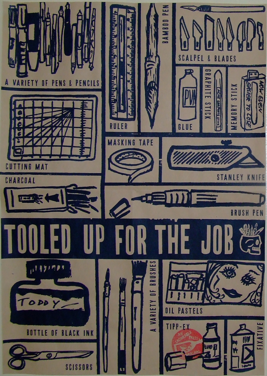
Tooled Up For The Job

"Don't draw your pens."

That's what I told myself when I started my time as an art student. I thought it too easy to focus on the mechanics of artwork and produce images that would strike a chord only with other artists.

Last month I was commissioned to do just that.

Before the start of this term, my tutors asked me to draw simple pictures of each of the items of stationery and equipment that the new students should have. Jonny and Derek came up with a list and sent me away for a few days.

We scanned the best drawing for each item and Jonny arranged them into a poster. He and Pete screenprinted a few dozen copies [pictured right] and I stamped them with "Unsinkable Press", for prints by the tutors.

Most of them were on pink cartridge paper, but here is one of the few on manila.


The posters were folded up and included in the first-years' welcome pack. I like to imagine them all heading down to Perry's art shop and showing the assistants what they need - before wincing at the prices.

It was fun to collaborate with the tutors and to stretch my drawing muscles before term started with time away from the drawing board, working on the dissertation, as I've mentioned.


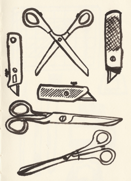
The sketchbook work started a bit shakily, as it always does. Here is a page of attempts at scissors and stanley knife from the point when I hit my stride; and a couple of early stabs at brush pen and scissors.

Thursday, 20 October 2011

Mantegna Cartoons

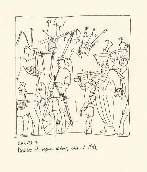
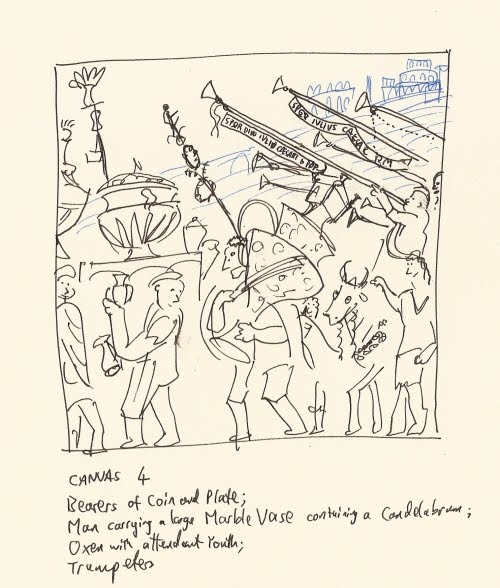
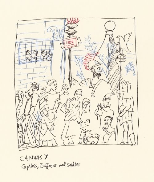
I'm writing an essay about Andrea Mantegna's "The Triumphs Of Caesar" series. For easy reference and to help me to analyse the nine canvases, I've sketched them from the reproductions in Andrew Martindale's book.