Showing posts with label Exhibitions. Show all posts

Sunday, 29 September 2013

Open Spaces

Last month I showed some workings for a piece about the New Forest.  It was for this year's open exhibition at Mottisfont (the National Trust house near Romsey), on the theme "open spaces".  I produced a three-colour screenprint together and it was accepted by the selection panel.

"New Forest Heathland"

The forest was my natural response to "open spaces".  The area of heathland south-east of Lyndhurst, down Beaulieu Road and across Yew Tree Heath is my favourite destination for an escape from town.  I wanted to depict not only the tiny details of gorse, fern and heather, but also the signs that the forest is a human landscape:  trig points, telegraph poles, pylons, sign posts, the obvious management of coppices, cattle and ponies and the constant flame of the oil refinery in the distance.

If I were starting the piece now I would be tempted to make reference to John Betjeman's passage about Lyndhurst in "First and Last Loves", in 1952.
People say you cannot properly see the New Forest from the main roads and they are quite right.  But on a warm evening you can smell it between the wafts of petrol scent which linger on the tarmac - the resin scent among the conifers, the coconut smell of gorse on an open heath, the tropic scent like the Palm House at Kew under oaks and beeches, where holly shines and bracken is a young green. 
Outside Lyndhurst the forest begins to look less wild.  Victorian brick cottages peep about among the trees.  Lodge gates stand guard to winding drives of laurel and azalea, at the end of which - how deep, how far, who knows? - are the country houses of the formerly rich.
Hanging my print!


Now one of my seven prints is nicely framed and up on the wall.  Even better...  I hung it myself.


The exhibition is in the upstairs gallery at Mottisfont
28th September to 17th November
11 - 5 daily

Sunday, 27 January 2013

Class Distinctions

"Class Distinctions" is an exhibition in the Wightlink ferry terminal in Yarmouth, Isle of Wight, from 11th January to 5th April 2013, in partnership with Southampton Solent University.


That's my piece, among others from the Illustration (Becka Potter's lovely and informative "Curious Creatures"), Fine Art, Fashion Photography and Make-up And Hair Design BA courses.


You can (and should) read more at the event page from Solent University...  and there's even a tumblr for the Faculty of Creative Industries and Society.

Saturday, 24 March 2012

Tudor House and Southampton City Art Gallery

Tudor House and Garden reopened last year, and I didn't visit until yesterday.  The garden is a tremendous oasis, especially in this week's blazing sunshine.  My "research trip" ended up taking a couple of hours.

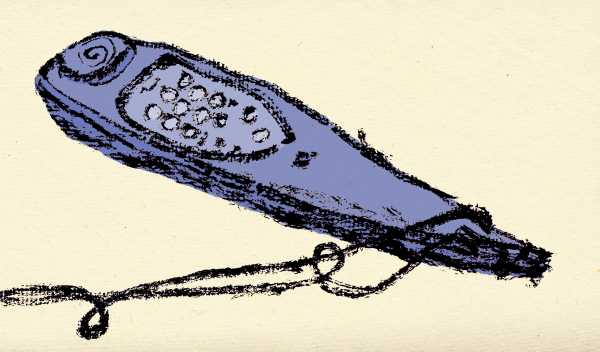
The property has so many periods and changes of use (variously between one and three dwellings; domesticity and small industry; falling apart, re-styled and heritage-ized) can't be concealed, but make it a place to have fun with history.  The Tudor garden has been straightened up; the old kitchens have satisfyingly smelly lacquered foods on show; the semi-dramatised audioguide (see the "wand" above) is pleasingly silly; there are medieval clothes to try on in a mirror; the remnants of the Edwardian museum have become an exhibit in themselves; and the Norman ruins of King John's Palace, behind the garden, are crying out for theatrical use.  There's even space for temporary exhibitions.  From March to October it's Susan Cutts' "Cherish":  paper pulp sculpted into gowns and garlands.

Before the Sea City museum opens next month, it's worth shouting about the City Art Gallery's impressively lively programme.  The calm, airy central hall always belies the bristling collection.  There's a grand show of Titanic art by local artists of all types (upstairs and downstairs); a retrospective of British surrealism centred on Roland Penrose, along with Desmond Morris and John Tunnard among others; a show of the use of the colour red in painting from the Renaissance to the 1990s (followed by a small room of work in many colours, with "Vorticist leanings", as if by way of adjustment into the hall again) and  pieces by two painting chimpanzees.

The new museum comes with the exciting prospect of a trip up the clock tower.  A view over the city is hard to come by - unless one arrives on a cruise ship; and the huge area of docks is a mystery to the general public.  The "Waterlitz" travelling performance should celebrate the port when it chugs into Southampton, with what looks, from the publicity material, like the colossal floating figure of a man, block-built of shipping containers, with Stomp-style industrial japery.  Here is a slightly nightmarish preview.  The big day is 16th June.

Monday, 19 March 2012

Paul Bommer

It's a while now since I last made pilgrimage to the capital from the provinces (well, Hampshire).

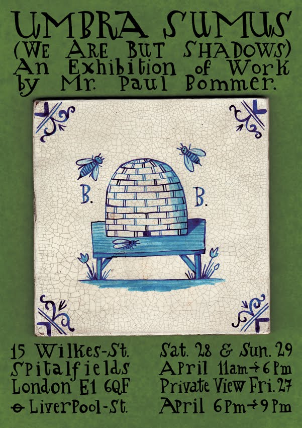
One upcoming reason to make a trip is the  "Umbra Sumus (We Are But Shadows)" exhibition by the rather exemplary illustrator Paul Bommer.  He's one of those artists who is working with a set of inspirations, methods and humour that I share and wish I could do so well; and he seems to churn out the fun "Twitter Ye May" series at an impressive pace.

It's on at 15 Wilkes St, Spitalfields on 28th and 29th April.

Another "he's everything I want to be" figure is Adam Dant, who lectured at Solent last Friday, and whose advice I'm trying to capitalise on for my degree show.

Also in April, the Comica Festival, featuring Tom Gauld and numerous others, is worth a visit - with a group of graduates, I hope.  What's more, my degree show will be in the East Gallery, Brick Lane, in July.  Back to it!

Monday, 23 January 2012

Building an Altar


Well, I finished my final minor project.  I'll show you the finished piece another time, and tell you about what went well and what I'll need to learn from, but here I'll talk about the process.


Influences


I've always been fond of the skewed perspective and stylised foliage and patterns of mediaeval art, from the Bayeux Tapestry, bestiaries and illuminations to recent imitations.  Terry Gilliam built his animations for Monty Python & The Holy Grail on it.  Pauline Baynes' illustrations for C.S.Lewis and Tolkien showed that she had internalised the art of European and Persian mediaeval manuscripts.  Her award-winning illustrations for Grant Uden's 1968 "Dictionary of Chivalry" was a major source for me, although I don't share her beautifully clean line.  I'm sure a lot of it comes down to having spent many hours in my teens doing this jigsaw of the fleur-de-lys legend from the Bedford Book of Hours, c.1423 (left).

In Italy I was surrounded by Byzantine and mediaeval religious art, and in September the National Gallery had an exhibition of Italian Altarpieces, which came into my disseration.  I've written before about Ed Kluz's paper reliquaries:  I was inspired by the physicality of those mysterious and timeless structures.  The current Grayson Perry exhibition at the British Museum is a pick-and-mix of unconventional methods of representation.

Here are my sketches of St. James escaping from Prison (in Padua); Donatello's statue of John the Baptist (at the Frari church in Venice) and Carpaccio's painting of St. Peter the Martyr (at Museo Correr in Venice).


The Altarpiece

I'll do this in pictures:  the research drawings, alternative plans, layout, jigsaw work and construction.


Prints and Images

In a previous post I showed some of the early sketches, and I could have carried on with those thumbnails, but I want to print the main images (to make them easy to reproduce in different colours, and to keep the colours simple).  Here are:  an early test for Justinian; a page of experiments; and the acetates for the two main images:  Justinian and Appollonia.


The course is to be exhibiting in the Bargate Monument Gallery in February!  My altarpiece will need improvements, but I'm looking forward to seeing it in there with everyone else's work.

Tuesday, 29 November 2011

Emily Sutton in Venice


Here are three pictures, by the wonderful Emily Sutton, of Rosa Salva, a cafe near where I stayed in Venice this year.

These and other works will be on show next month (3rd to 24th December) in Edinburgh, at the Scottish Gallery.  Here is their site.

Looking over photos of my trip has reminded me of the ideas that I had during that time, and that I never had time to follow up.  Since I returned people have expected me to be making art about Venice.  I'm hanging onto the claim that the Martyrs idea came from Italy.

I'll be screenprinting for much of today.

Sunday, 13 November 2011

Cutting Edge, Mottisfont

Another exhibition to see if you have the chance.

This one is at Mottisfont, near Romsey.  The grounds and the rose garden have been a big attraction for years, along with the ground floor of the house.  In the 20s and 30s the house welcomed numerous artists, whose work fills the ground floor.  In the past year the National Trust has opened the upper floor (formerly flats and offices) as a series of exhibition rooms, complementing the strong collection downstairs.

"Cutting Edge" is a show of six artists working with paper in one surprising way or another.

The hallway downstairs is hung from ceiling to floor with Eileen White's paper structures, "Come, Heavy Sleep" (named after the song by John Dowland); and the exhibition covers a complete range of size, right down to John Dilnot's tiny paper owls in miniature woodland scenes, and back up to Jonny Hannah's giant matches.  His roomful of vibrant Americana comes after the quietly bewitching and romantic papercuts by Rob Ryan (watch this interview at Printeresting), including a new piece, which is more enjoyable for sitting out from the wall very slightly.  Sally Sheinman's evolving project about human DNA invites the viewer's input.

Best of all is Ed Kluz:  his six "reliquaries" - crisp, clever paper models of pavilions and shrines, each in a glass cloche, clinging to paper rocks and surrounded by paper greenery and even paper water.  He is making the most of the structural qualities of different papers and cards, and the colours are rich like old toys.  They have a room to themselves, looking out over the lawns and woods around Mottisfont, a fitting setting for these mysterious old follies.


Cutting Edge
12th November 2011 - 29th January 2012
Mottisfont,
near Romsey,

Thursday, 27 October 2011

Peter Jarvis Watercolours


Peter Jarvis (here is his website - look at his blog) is exhibiting his watercolour paintings in the foyer of Southampton Solent University from today.  The pieces are built around precisely replicated architecture.  The best images include settings of very convincing depth; vivid trees and graded skies.

Most of the exhibition is given to the sites of Southampton's old town.  Tudor House, God's House Tower and the others are rendered with great appeal.  More fascinating, though, are the close-ups of ancient stonework dotted with plant life and shifting shadows of branches; and two studies of metal boats rusting on the River Itchen.  These are more engaging than studies of stone and iron should be.

Aside from a view of Stokesay Castle, Shropshire, the main departure from the south coast is a set of nine round-towered Saxon churches in Norfolk (out of the one hundred and twenty-six in that county):  Bedingham, Brooke, Freethorpe, Geldeston, Hemblington, Morningthorpe, Seething, Surlingham and Thorpe next Haddiscoe.  They take me back to a happy holiday cycling in Norfolk, seeking out these little churches, and they're a great subject for a series.

A case of sketchbooks of all sizes shows Peter Jarvis' practice of sketching on site, usually outdoors.  It's easy to deprecate "Sunday painters" and the washy chocolate-box landscapes associated with watercolours.  These pieces, however, are a concert of three elements.  The stunning architectural draughtsmanship is made appealing by Peter's command of the subtlety of watercolours, making the views crisp, yet softened by every variation in colour.  In turn, Peter's eye for strong colours and warm sunlight in the surroundings brings the viewer half-way into the quiet, unpopulated scenes.

Of course, it's all pretty enviable and very different from my work, but it's a pleasure to see Southampton given such a treatment and, having met Peter now and then in the past couple of years, to see a proper display of his work.


A Point Of View:  a solo exhibition by Peter Jarvis
28th October 2011 to 7th January 2012
Concourse Gallery, Michael Andrews Building,
East Park Terrace, Southampton

Solent Website

Thursday, 28 April 2011

Record Sleeve Love and Girl Groups

As I think I've mentioned before, old record sleeves are a constant source of inspiration or fascination. Best of all are the old paper sleeves from 45rpm 7" singles.

Things that I love:
  1. the typefaces
  2. the limited colours
  3. the wear of the thin paper
  4. the way that the designs work with the hole in the middle
  5. the occasionally-misaligned printed blocks
  6. the arcane company addresses
  7. the enthusiastic advertising language
...and I could go on.

Well, they're hardly in short supply: you can go into any charity shop and find boxes of singles to rifle through. You can probably find a relative with a box somewhere.

Today I've found a website that does that job for you and collects gems from all eras and styles of music on vinyl: Record Envelope: The Little Library Of Factory Sleeves.

I've dipped into my parents' little carry-case again and again over the years. The designs are often fun to behold, but even more interesting are the advertisements that used to cover inner sleeves. The same goes for paperback books from around the 1940s. Advertising wasn't any less pervasive in those times.

Here's the back of a Colombia Records sleeve, on Des O'Connor's "Thinking Of You", the b-side of "I Pretend",

B
efore bed-time...
A Great Morphy-Richards Offer!
"Simply beautiful hair"
by French of London

It's a cross between an instruction diagram and a teen-drama comic strip, another bit of pop culture that is revived from time to time. Here's Betty Rizzo's moment in the titles from Grease (from a full dissection at Clothes On Film).

Those titles in turn inspired Kenickie (if the name wasn't an obvious enough homage), the band that Lauren Laverne fronted in the late 1990s. They started out with a strong girl-group / heartbreak / biker gang vibe, like the Shangri-Las, the Crystals, the Shirelles and so on. Here's the cover of the "Punka" single from 1996.

The style pops up every few years: The Pipettes were doing much the same thing; and over the past few years The Girls, two British artists (Andrea Blood and Zoe Sinclair) have been installing their exhibition / performance art piece "The Paper Eaters", making modern-day teen-drama photo-stories. They had amazing dresses made out of comic strips.

Back to the sleeves: other great finds at Record Envelope include the Micron Music sleeve (the black one near the top of this post) and the home-made Elvis Presley sleeve.

Wednesday, 22 December 2010

The Museum Of Everything

This is another temporary exhibition built out of Peter Blake's amassed ephemera of British culture over the past couple of hundred years. A lot of it is concerned with circuses, fairs and freakshows; and outsider art from shell artists to taxidermy (Walter Potter), tapestry (Ted Willcox) and Cheeta The Chimpanzee, the first non-human to exhibit in the National Gallery.

There were a lot of signs against photography. I made notes and drew, but the prohibition is a good reminder to take everything in in the time spent there, and to treat the whole thing as it was intended: not as a taxonomy of old-fashioned crafts, but a huge three-dimensional collage.

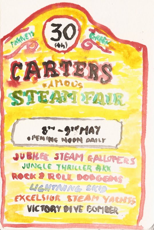
Carters Steam Fair looks like immense fun - and I've just found that it's still running!, complete with a wall of death.
Jubilee Steam Gallopers!
Jungle Thriller Ark!
Rock & Roll Dodgems!
Lightning Skid!
Excelsior Steam Yachts!
Victory Dive Bomber!

Tuesday, 21 December 2010

Swimming Pool

I've just been at the swimming pool. There isn't always music on, but this week there is - and it's all Christmas songs. My breast-stroke was hampered by a big grin when, after "Last Christmas", "Santa Claus Is Coming To Town" and "All I Want For Christmas Is You", the hall echoed with water-distorted orchestras on the most extravagant 1940s renditions of "White Christmas" and "The Christmas Song".

The pool looks a bit like this:


It's the screenprint that I was working on a couple of weeks ago. Something went very wrong, but it looks decent and may be worth revisiting.

That reminds me (by obvious debt, as you'll see below): the Bridget Riley roadshow has rolled into the National Gallery for the next few months. It's a different exhibition from that which has toured for the past year or two. Riley's team has painted some new and recent works onto the walls. Since my visit, I've been comparing them to the influences presented in the exhibition. Paintings by Seurat, Raphael, Mantegna and Van Eyck (an early copy by Riley) indicate the roots of Riley's approach to the interplay of elements; colour choices and the optical tricks of image-making. Best of all (although it perhaps shouldn't be), David Thompson's captivating film is there again.


"Red With Red 1", 2007.
Photograph: Bridget Riley/Courtesy Karsten Schubert, London.
From this Guardian article.

Wednesday, 1 December 2010

White Christmas At Solent

December has started with snow and the illustration course at Solent has installed a Christmas tree piece in the main university reception. It's a good eight feet tall; made of wood; gaily painted and covered with doors, making it an advent calendar.

If you can, you'll have to go and see it in situ. As a bait, here are just the doors.


The piece was commissioned by Millais Off-Site Projects at Solent. Jonny Hannah masterminded the project. He and a group of the third-years painted and assembled the tree and made artwork to go behind the doors. I did a bit of sanding. The others involved are Alex Usher, Jen Hainsworth, Ryan Medlock... and here I'll have to add in the two that I don't know. [EDIT: they are Clari Csuk and Kate Wood!]

I'll show the insides later. Go and see it!

Monday, 15 November 2010

Saturday

To the Natural History Museum to revisit the hall of minerals because I was reminded by the work by Boredom Research at Millais Off-Site Projects in Southampton.


Next to the V&A to make a survey of the ironwork for reference.


Then I realised: I'd photographed agate followed by a gate.

Wednesday, 10 November 2010

Evening At St Jude's

Angie Lewin's "Thames Fireworks" linocut.

St Jude's is a gallery in Norfolk that brings together a number of contemporary printmakers. From time to time they exhibit in London under the name St Jude's In The City.

The current show is on for a couple of weeks at Bankside Gallery. Last night was the opening night and I tagged along because two of my tutors have work on display: Charles Shearer and Jonny Hannah. It was a real pleasure to meet some of the artists and find approaches in common with other people from the illustration / printmaking world.

I particularly liked the pieces by Ed Kluz, Alice Stevenson and James Brown.


That's the view from outside, on the south bank, without fireworks.

Thursday, 4 November 2010

Warhol In Southampton

This evening BBC4 showed Ego: The Strange And Wonderful World Of Self-Portraits. Laura Cumming carried out a thoughtful and engaging survey of the genre, from Albrecht Dürer to Mark Wallinger.

On the way (near the end) she covered Andy Warhol. Lately I've heard bits and pieces about a Warhol exhibition coming to Southampton. The show will be spread across the Southampton City Art Gallery and the John Hansard Gallery. Southampton University article; Artist Rooms page.

I haven't watched television for months. This evening, after Ego, The Pre-Raphaelites, The Culture Show and Nigella Kitchen, I may be convinced to make it a regular activity.

Friday, 22 October 2010

Bridget Riley


Flashback

Southampton City Art Gallery, 17th September - 5th December.

Bridget Riley's retrospective exhibition has been on the road. Over the past year or so the collection has been shown in Liverpool, Birmingham and Norwich. Now it's at Southampton City Art Gallery, from 17th September to 5th December.

Those waves in my linocut (in the post below) remind me of Bridget Riley's famous black and white striped canvases from the 60s. Her pieces were instantly successful and engaging and entered the imagery of Swinging London. People respond to them in different ways, and sometimes have difficulty viewing them as pieces of art. They often seem more like optical illusions and colour theory, tricking the eye and creating movement. I find these perfectly valid and satisfying in an exhibition, which is why I'm glad to have seen the show both in Birmingham and Southampton.

The exhibition shows three or four rough periods of Riley's work, in chronological order. First comes the early monochrome precision and then the shimmering colour palettes ("June" almost invokes an actual scene). The final section is two huge canvases from recent years, combining surprising colours and comparing straight lines and curves, always with razor-sharp edges.

The Birmingham show was all in one room, to Southampton's three, which separate the time periods rather ruthlessly, even if the chronological flow is intended. However, the third room, isolating the two largest pieces, opposite each other, provided the best venue to give the work time (I'm considering a dissertation on the importance of a good gallery bench for the public appreciation of art). They could be on a boardroom wall, but the nuances of colour and the positioning of curves and verticals seem too specific.

This makes the show sound like a scientific treatise in optical theory. I'm content to enjoy that aspect, but it is really a riot for the eyes (particularly the second room). The meditative aspect is brought out in the video at the end of the exhibition. David Thompson's 1979 film shows Riley at work with numerous assistants, carefully adding lines and placing shapes (and I wish I was one of them); combined with lingering shots of water and branches; and clever filming that replicates the movement of the eye over the paintings.

If there's a progression over-all, I'd like to say that Riley loosened up, but a quick look back at the start shows that the playful streak has been present from the start. Every stage is dazzlingly clever and literally dazzling.


Post-script:
I was in the Art Gallery at noon and had forgotten about the clock tower's chimes. The melody is "St Anne", the most common tune for "O God Our Help In Ages Past", written by Isaac Watts, born in Southampton in 1674 and celebrated in Watts Park, over the road from the Civic Centre. I love that connection and trail of associations - which I needed my mother to unscramble.

Tuesday, 19 October 2010

Black Icons

A quick one before I dash back to the university to retrieve my diary. I was helping to collate a mailout for the Millais Gallery.

Anyway, the main entrance at Solent now hosts a full exhibition of prints by Ed Brown and Ryan Gillett, commissioned to celebrate Black History Month (November). Each piece shows a different historical figure and some fun use of text. The work was created and exhibited in part last year, and gained a bit of publicity. Now they're all on show and I went along to the opening because I trimmed and framed the set, and was assigned to help Ed with the setting-up of his degree show in June.

Here is Marcus Garvey on the banner and the two ends of the display.

Sunday, 26 September 2010

London Lives


London Lives

Bankside Gallery, 9th to 19th September 2010

Bankside is a contrast to the grand galleries. Instead of season-long tableaux of artistic titans, Bankside puts on short exhibitions that show the pulse of creativity. The gallery is a platform for a huge number of contemporary artists, so the displays really must change frequently. Even so, despite a run of only eleven days, London Lives, the top selection of a competition, was a dense and bristling collection of a hundred artists' submissions. That amount and wealth of work is what allows the show to represent London: a hundred aspects of the city and its surroundings. That variety allowed different media and different emphases to complement each other, capturing not only the timeless destination-views of the capital but the passing atmospheres of busy, changing streets.

London Lives.

Raphael


Raphael: Cartoons and Tapestries for the Sistine Chapel

V&A, 8th September to 17th October 2010

Only a week before the Pope's visit to London, the V&A's Raphael Court was augmented with this exhibition of tapestries commissioned for the Sistine Chapel in the Sixteenth Century.

The notes accompanying the display make the power games of the Vatican today look transparent and unbiased by comparison to the manoeuvres of the Medici. The selection of Biblical scenes for the chapel leant towards those that "reinforced the authority of the papacy" - ie. scenes of St. Peter, St. Paul and the early church.

The tapestries correspond to the cartoons (full-scale painted draughts on paper) that are on permanent display at the V&A (on loan from the royal collection after centuries at Hampton Court Palace since Charles I acquired them in Brussels before his ascension). In some places an additional painted copy is shown alongside. I found the most engaging part of the exhibition in comparing the sketches, cartoons, painted copies and interpretations by tapestry artists. Colours that work well in paint were swapped for ones that stand out better in fabric; extra space was given to craftsmen who excelled at foliage or wildlife.

The larger changes range from the theologically significant (Christ's position and gesture in "Christ's Charge To Peter") to the mildly-entertaining (on the tapestry Christ's white toga, unlike the cartoon, is covered in little golden suns). A case of sketches shows preparatory drawings of models making the same scene in everyday Renaissance dress.

Collectors in the Eighteenth and Nineteenth Centuries admired Renaissance artists' ability to "tell their story plainly". Raphael's images were revered for their "clear, dramatic narrative". The drama and dynamism are in fact souped up in the explosive stupification of onlookers at "The Death Of Ananias" and the fishermen straining at the nets in "The Miraculous Draught Of Fish".

The effect of all of this is spoiled when visitors turn to see the "Retable of St George", one of the permanent fixtures in the room: a magnificently painted and gilded altar screen demanding closer inspection. Very soon they recoil in horror when they see a few few moments of piety and triumph overwhelmed by a series of increasingly gruesome ways to die.

So, away from the subject of Raphael, here is a full list:

Retable of St George, c. 1410: altarpiece from the Chapel of the Confraternity of the Centinar de la Ploma

  • The Holy Spirit
  • Christ with the orb
  • Moses; Elijah
  • St John; St Luke; St Mark; St Matthew
  • The Virgin Mary and the Child Crowned by christ and Surrounded by Angels

  • A Christian Army under James I of Aragon Defeats the Moors with the Help of Saint George at the Battle of Puig in 1237
  • Saint George Ties the Dragon with the Princess's Girdle
  • The King, Queen, Princess and the People of Silene are Baptised
  • Saint George Denounces the Pagan gods before Dacian
  • Saint George is Tortured tied to a Cross
  • Saint George Survives Poison
  • Saint George is Tortured on a Table
  • Saint George is put in Prison
  • Saint George is Tortured between two wheels
  • Saint George is Tied between two Posts and Sawn in Half
  • Saint George is Tortured in a Cauldron
  • Saint George at Prayer
  • Saint George Fights the Dragon
  • Saint George is Dragged by Horses
  • Saint George is Beheaded

  • The Agony in the Garden
  • The Betrayal
  • Christ before Caiaphas
  • The Flagellation
  • The Mocking
  • Christ Bearing the Cross
  • The Crucifixion
  • The Deposition
  • The Entombment
  • The Resurrection
It's fascinating and it's horrible.

Wednesday, 22 September 2010

Eadweard Muybridge / Rachel Whiteread


Eadweard Muybridge


Muybridge is best known for his photographic studies of humans and animals in motion: multi-angle series of shots of, say, a woman walking down a set of steps and turning; or the image that proved that a horse can have all four hooves in the air in the course of galloping. I heard visitors announcing to each other "This is what we've come for" when they reached zoopraxiscopes and zoetropes (the contraptions that animated these series) two thirds of the way through this exhibition. Like me, they probably remember their inclusion in childhood books of experiments. Moving or 3D images are inately entrancing to us (remember the arrival of magic-eye pictures), but it is clear how, in the 1870s and 80s, Muybridge advanced cinematography, zoology and figure-drawing.

The preceding few rooms show the continuation from his ground-breaking work in photography - both the art and the technology. An Englishman in America, Muybridge (who frequently revised his name and identity) was keen to make the most of the newest arenas. His single-mindedness (which may have lead to some questionable ethical and moral choices, leaving aside the accusation of murder) and innovation are clear even today and his travels result in a document of American expansion in the second half of the 19th century, complete with Indians and Chinamen.

The daring and sometimes mind-bending views of Yosemite and San Francisco (I spent some time working out which way up the book should be, with another visitor) convey the wonder and the lure of both the American landscape and its new towns. It's not just because I've been there that these settings make the later images of Panama and Guatemala look quaint, despite their theatrical poise and precision.

Although the first few rooms hop about in the artist's chronology, they all lead up to the big draw, the high-tech experiments involving rapid-fire work with multiple cameras, prefiguring Matrix-style "bullet-time". He tried everything: analysing the movement of people with physical impairments; wrestling; splashing about in tubs of water; getting into bed and, most amusingly, a woman in a full Victorian dress and a large hat, leaping over a stool. The camera's ability to stop time and to split a subject into multiple angles (a trick replicated for visitors with a clever glass wall at the entrance and exit) proved what the eye couldn't see and still struggles to believe.


Rachel Whiteread Drawings

I can't imagine a more opposite artist to have printed on the same ticket and exhibited just through a wall or two from the Muybridge show. In the work of Rachel Whiteread it is the spaces that are captured and frozen; arenas of human activity are rendered monumentally still; busyness countered with contemplation.

Throughout this Autumn, Tate Britain hosts a fairly conventional appreciation of Eadweard Muybridge right next to this smaller (and cheaper) exhibition showing the byproducts or sideline of Whiteread's immense public sculptures: her sketches, drawings and doodles.

Some pieces show visual preoccupations that fed into full-scale work; some are simply intriguing by showing Whiteread's playful experiments with line; some show the construction behind specific works such as the Holocaust Memorial.

It's informal but technical, and accomplished despite being created without display in mind, but has no real conclusion. I'm not sure that the organisers know what to do with a collection that is neither a body of related work nor a progression of complete statements, but a scrapbook of a journey that isn't yet finished.


These two shows are running at Tate Britain from 8th September 2010 to 16th January 2011. Extra marks to the Tate for the A6 exhibition guides.


Post-script


On the subject of Yosemite, let's compare Eadweard Muybridge at Mariposa Grove in 1872 to my sister at Mariposa Grove in 1998. I've been debating whether it's the same tree.